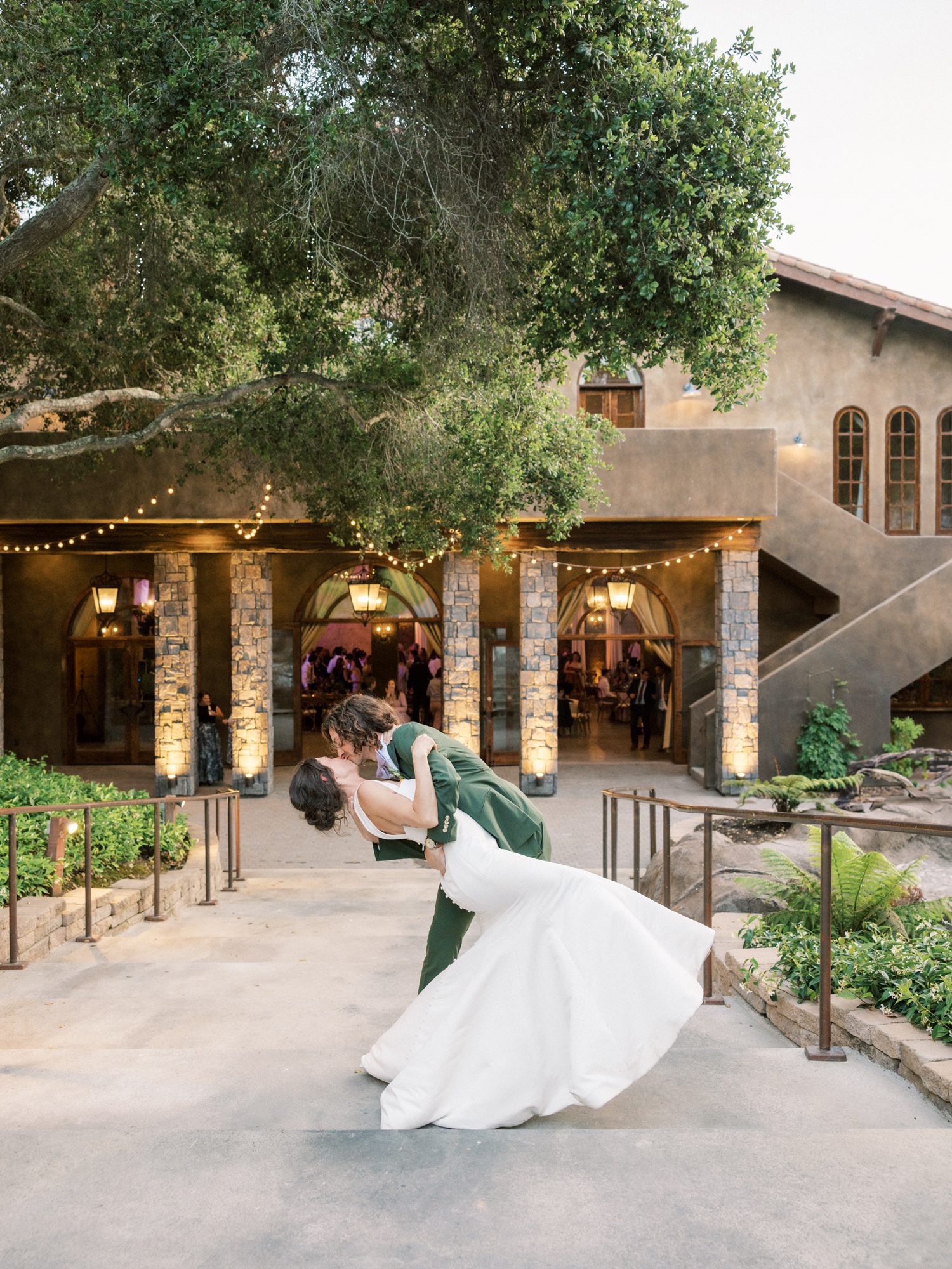
Venue // Villa Loriana
A Color Story Rooted in Personality
Genevieve and Cody’s wedding felt like stepping into a garden that had been dreamed up, painted, and then brought to life. Nothing about it was overly polished or predictable, it was layered, expressive, and personal in a way that made every detail feel intentional.
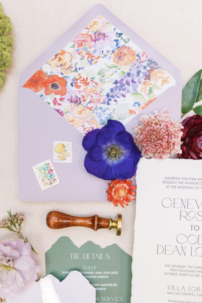
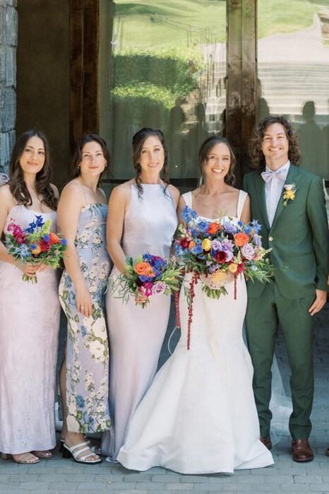
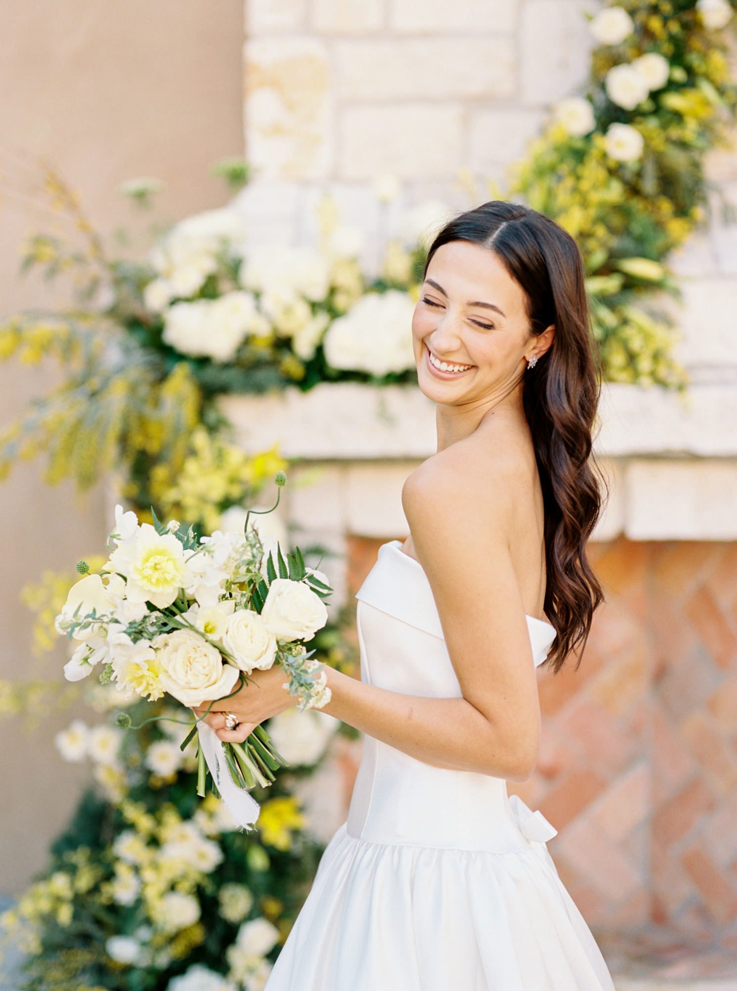
From the very beginning, color led the conversation. Lavender anchored the palette, but it never stood alone. It was joined by saturated florals—poppy reds, inky purples, soft corals, and that perfect shade of golden marigold—creating a collection of hues that felt more like an artist’s palette than a traditional wedding scheme. The result was vibrant without feeling loud, refined without losing its sense of play.
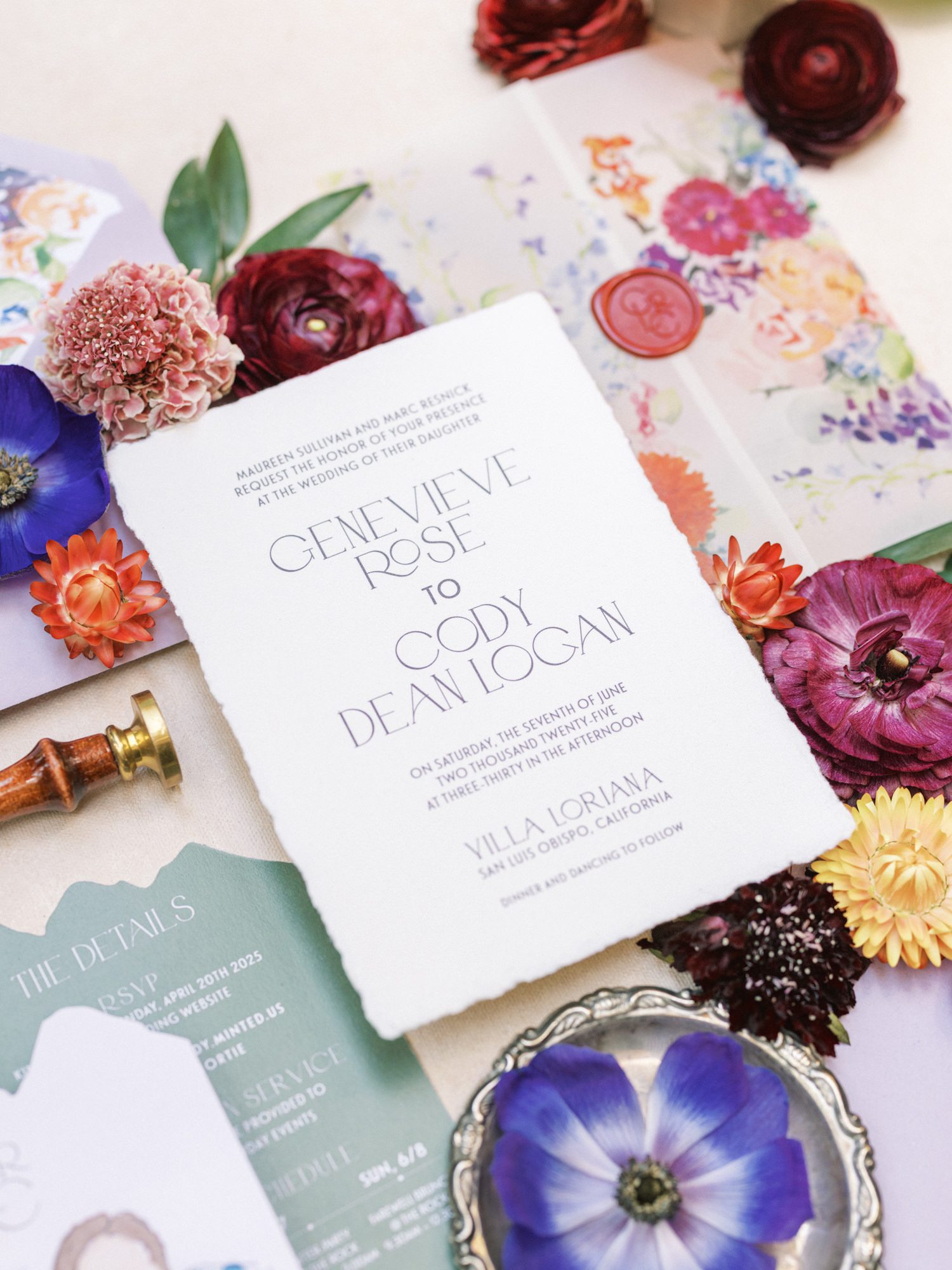
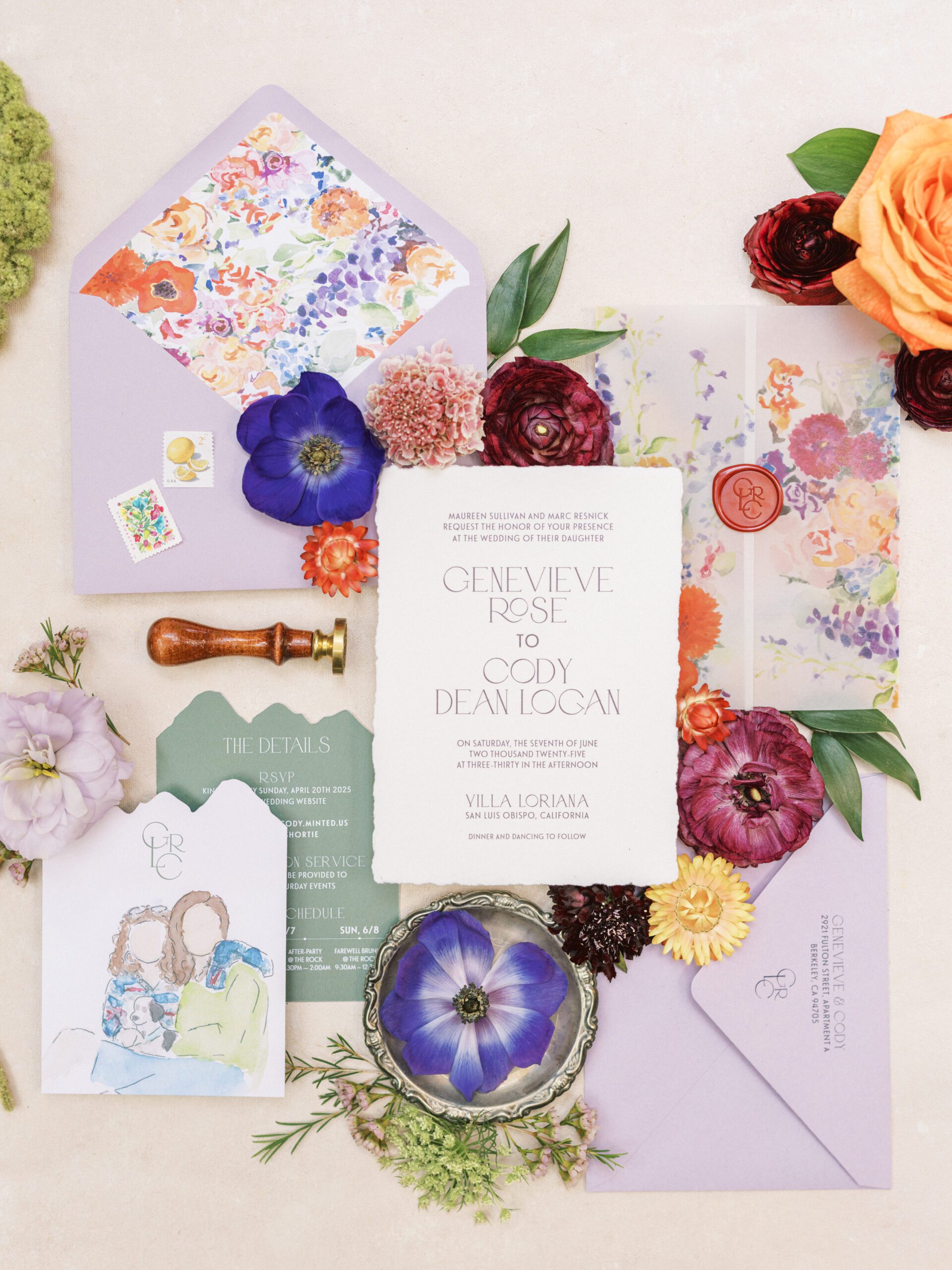
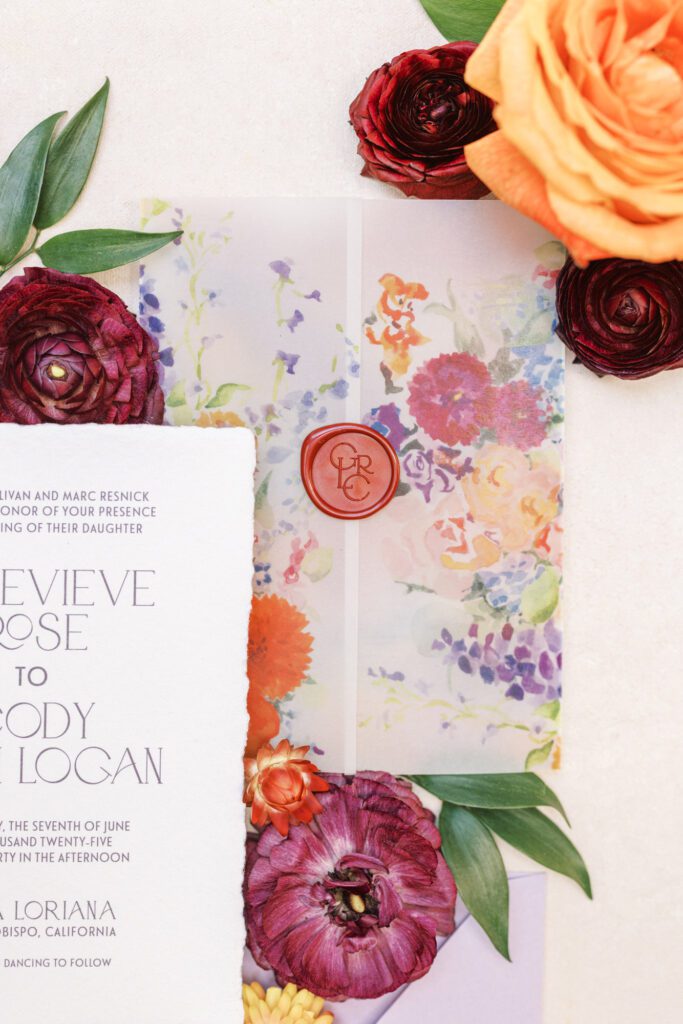
The Invitation Suite: Texture, Color, and Story
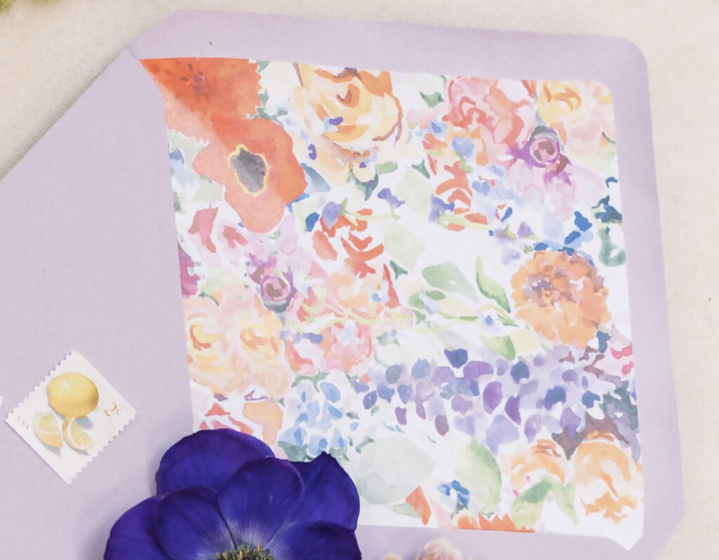
The suite set the tone immediately. Handmade cotton paper with a soft deckled edge gave the invitation a quiet weight in your hands, something you noticed before you even read a word. Paired with that was a watercolor liner, full of movement and color, almost like it had been lifted straight from a sketchbook.
A vellum wrap brought everything together, sealed with a wine-red wax monogram that felt classic but not too formal. It grounded the color story just enough.
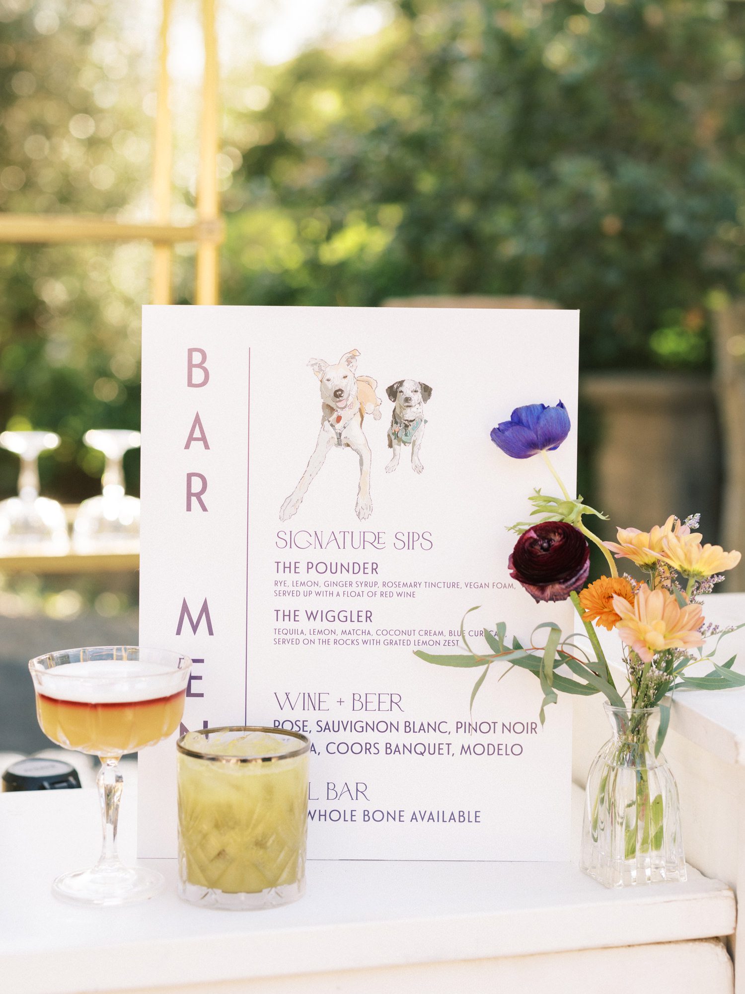
Personal Details That Carried Through
That same sense of personality carried effortlessly into the day-of pieces. The mountain-inspired details card hinted at places that mattered to them. The bar signage echoed the illustrations, bringing their story into cocktail hour in a way that felt cohesive rather than repetitive.
Even the smallest elements: postage, stamps, the way pieces were layered, felt considered.
Nothing was filler. Everything had a role.
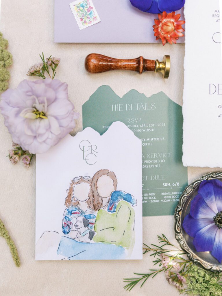
But what made this suite linger was the storytelling.
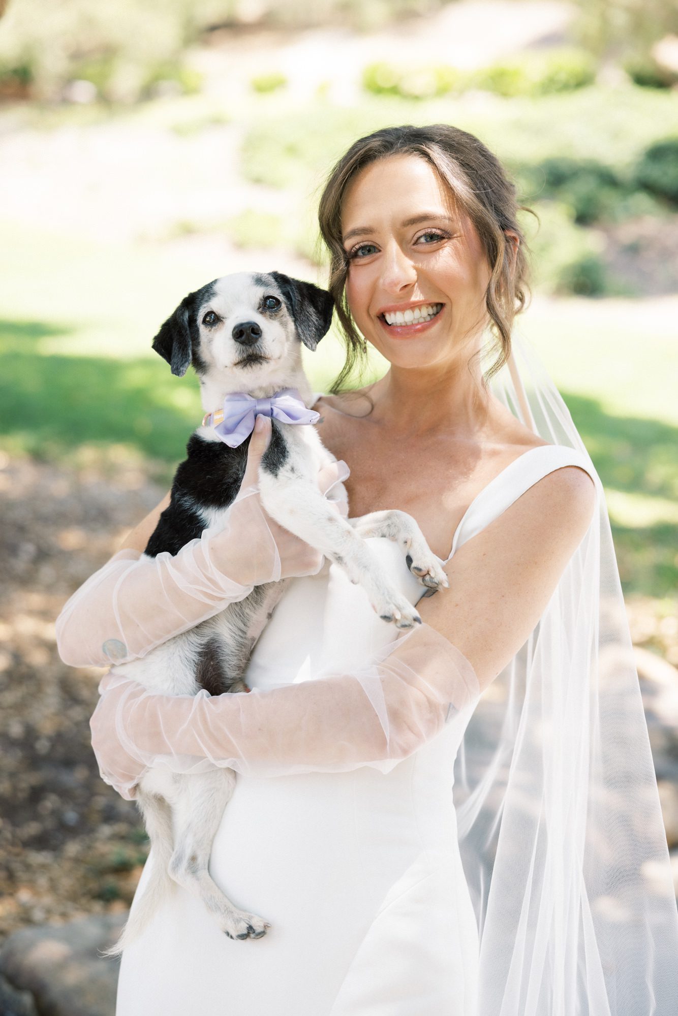
A watercolor portrait of Genevieve and Cody, with their first puppy, Shortie, was tucked into the details. It was subtle, but meaningful in the way the best details always are.
You didn’t just learn when and where, you got a glimpse of who they are.
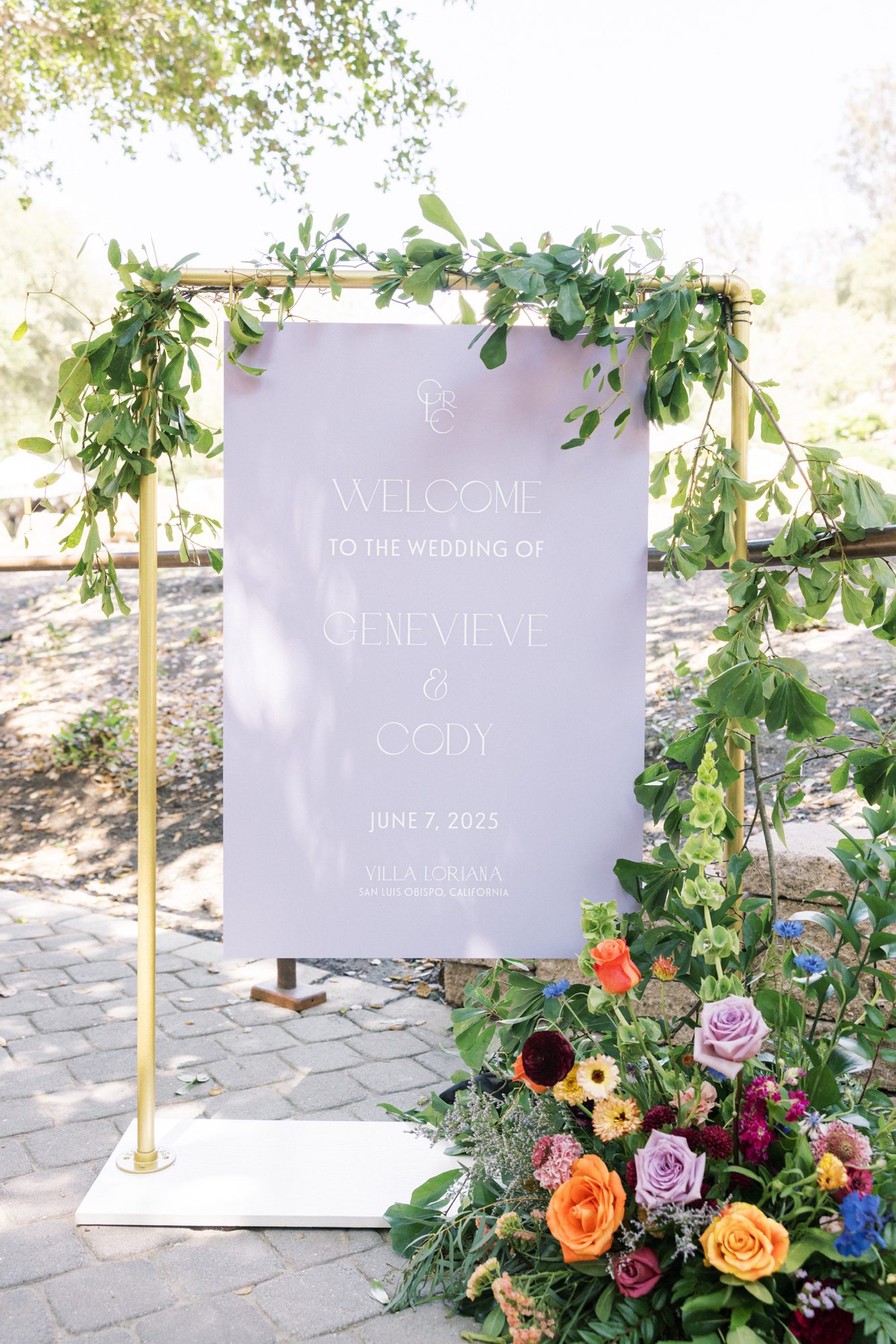
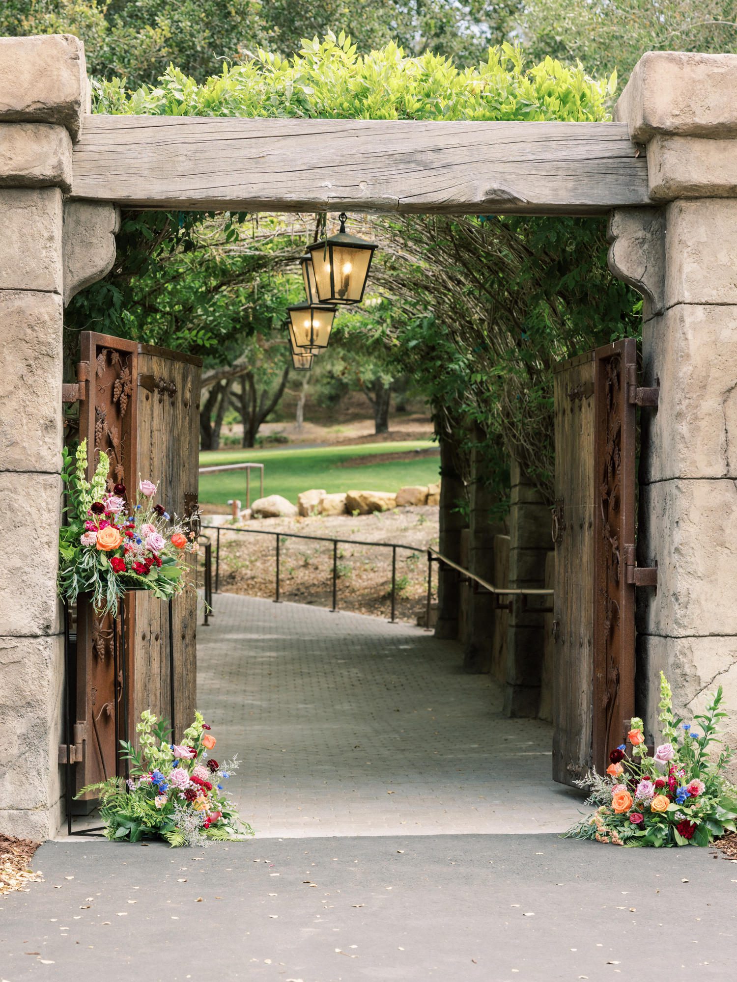
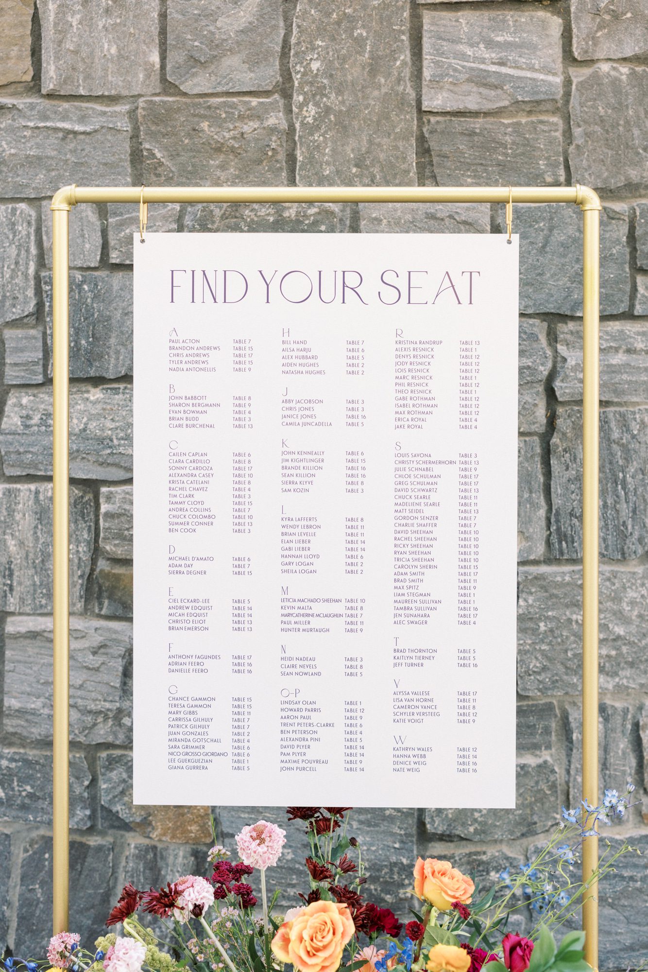
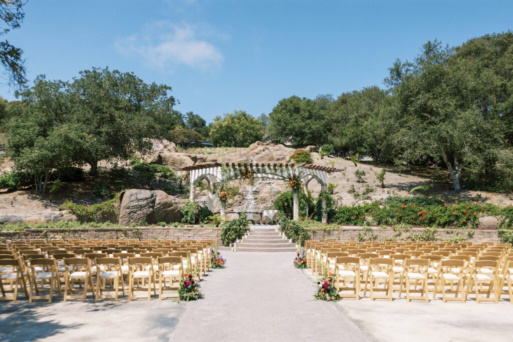
Ceremony Signage That Set the Tone
The ceremony experience began well before the aisle, with a welcome sign that felt like a natural extension of the invitation suite. Printed in soft lavender and framed in warm brass, it introduced the color story in a way that felt both subtle and intentional.
The typography remained clean and understated, allowing the tone and palette to lead. Paired with lush, garden-style florals at the base, the sign created a layered moment. It felt grounded in the environment while still clearly tied back to the stationery design.
As guests moved through the space, the visual language remained consistent. From the first impression at the entrance to the ceremony beyond, every detail felt connected, quietly reinforcing the suite’s role in shaping the overall aesthetic of the day.

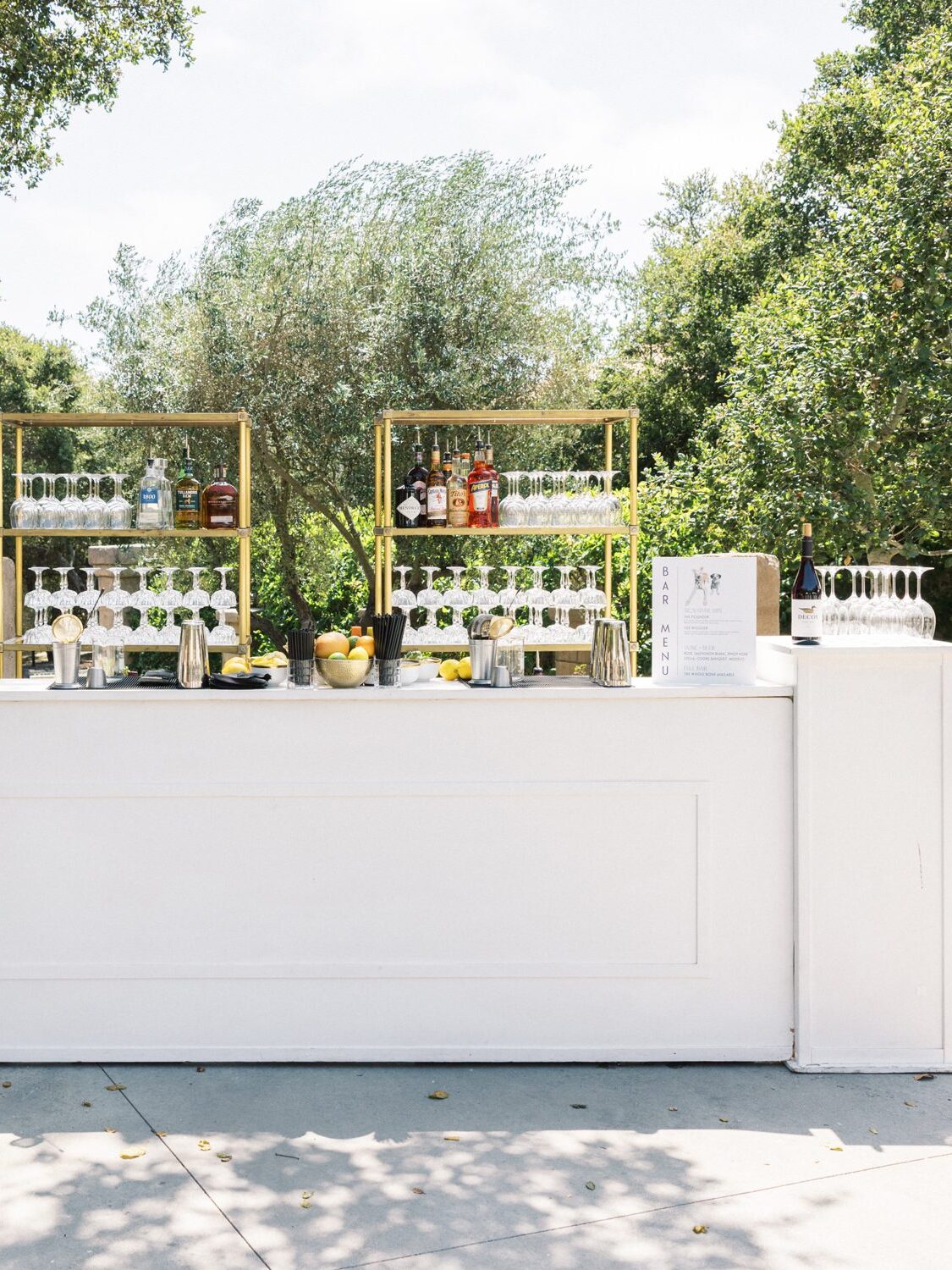
Reception Details with a Playful Edge
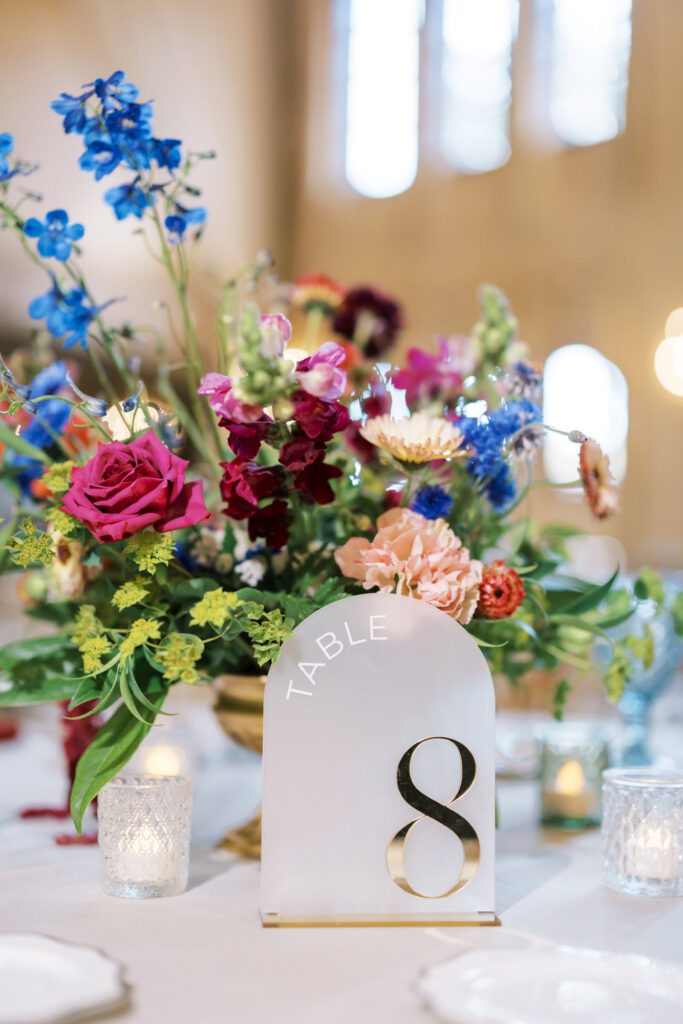
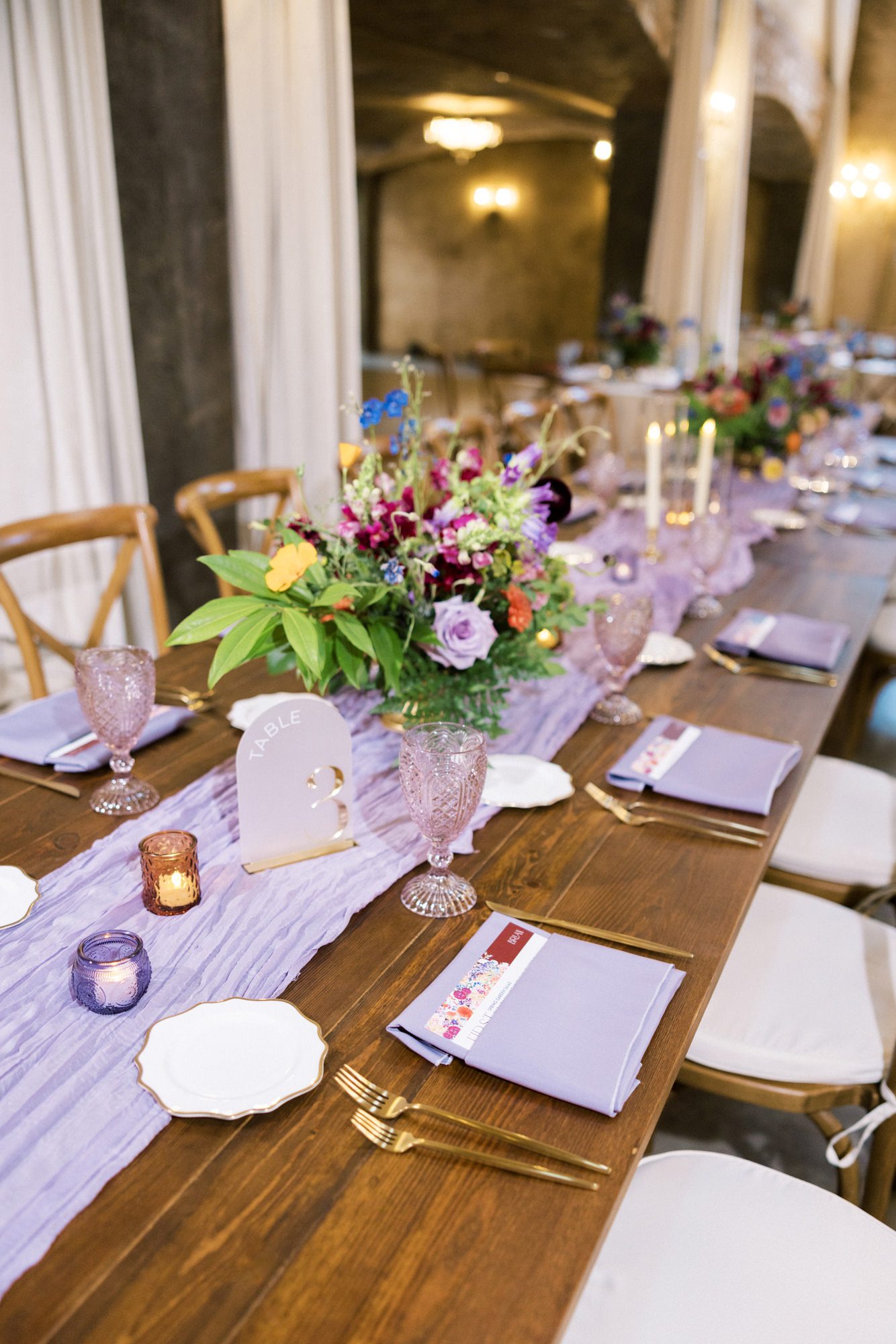
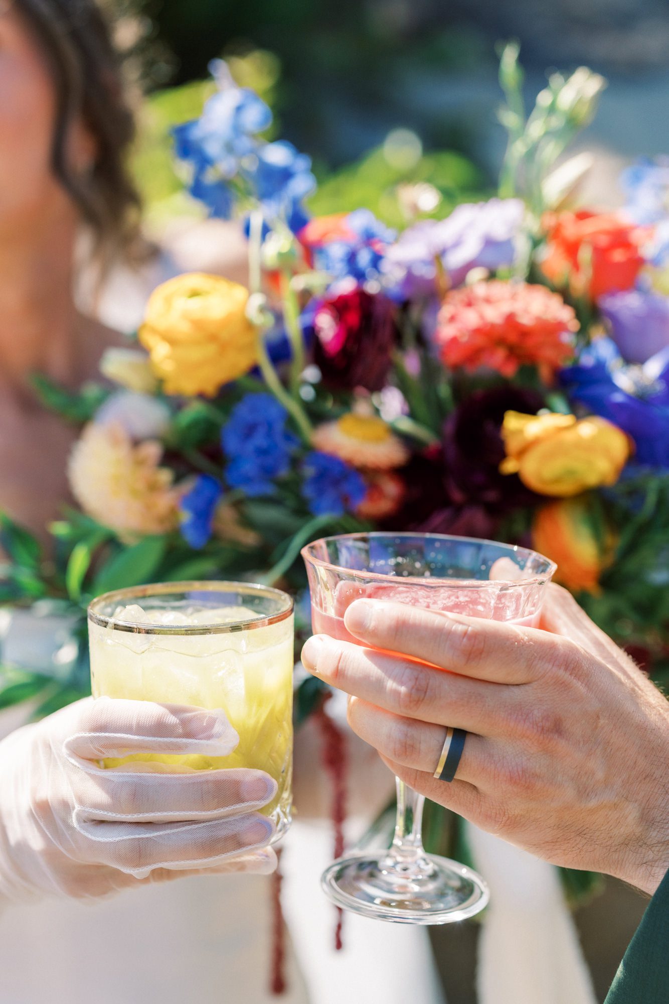
Inside, the reception balanced softness with structure. Long wood tables were layered with lavender runners, delicate glassware, and florals that felt intentionally uncontained.
Menus were placed horizontally at each setting, personalized for guests, one of those details that feels small until you’re the one sitting down and noticing it.
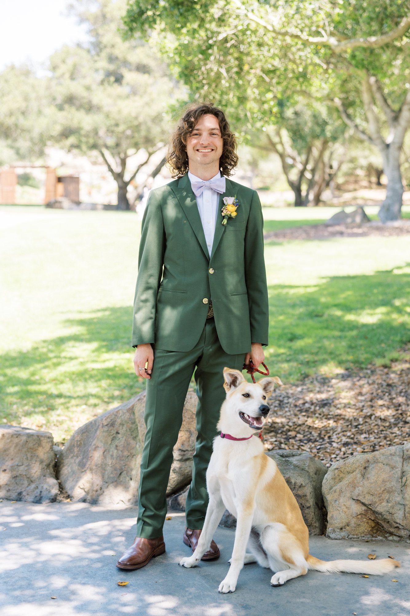
The seating display was clean and minimal, allowing the florals below it to bring the color. Lavender napkins echoed the bridesmaids’ dresses, while olive green accents subtly pulled in Cody’s attire.
A Celebration That Felt Like Them
There’s something special about a wedding where you can trace a single idea all the way through, from the first envelope opened to the last toast of the night, and it never loses its meaning along the way.
Genevieve and Cody’s day did exactly that.
It was thoughtful without being overworked, colorful without being chaotic, and personal in a way that felt natural at every turn. The kind of celebration that doesn’t just look beautiful—it feels like it belongs entirely to the two people at the center of it.


