Venue // Private Estate

A Classic Foundation
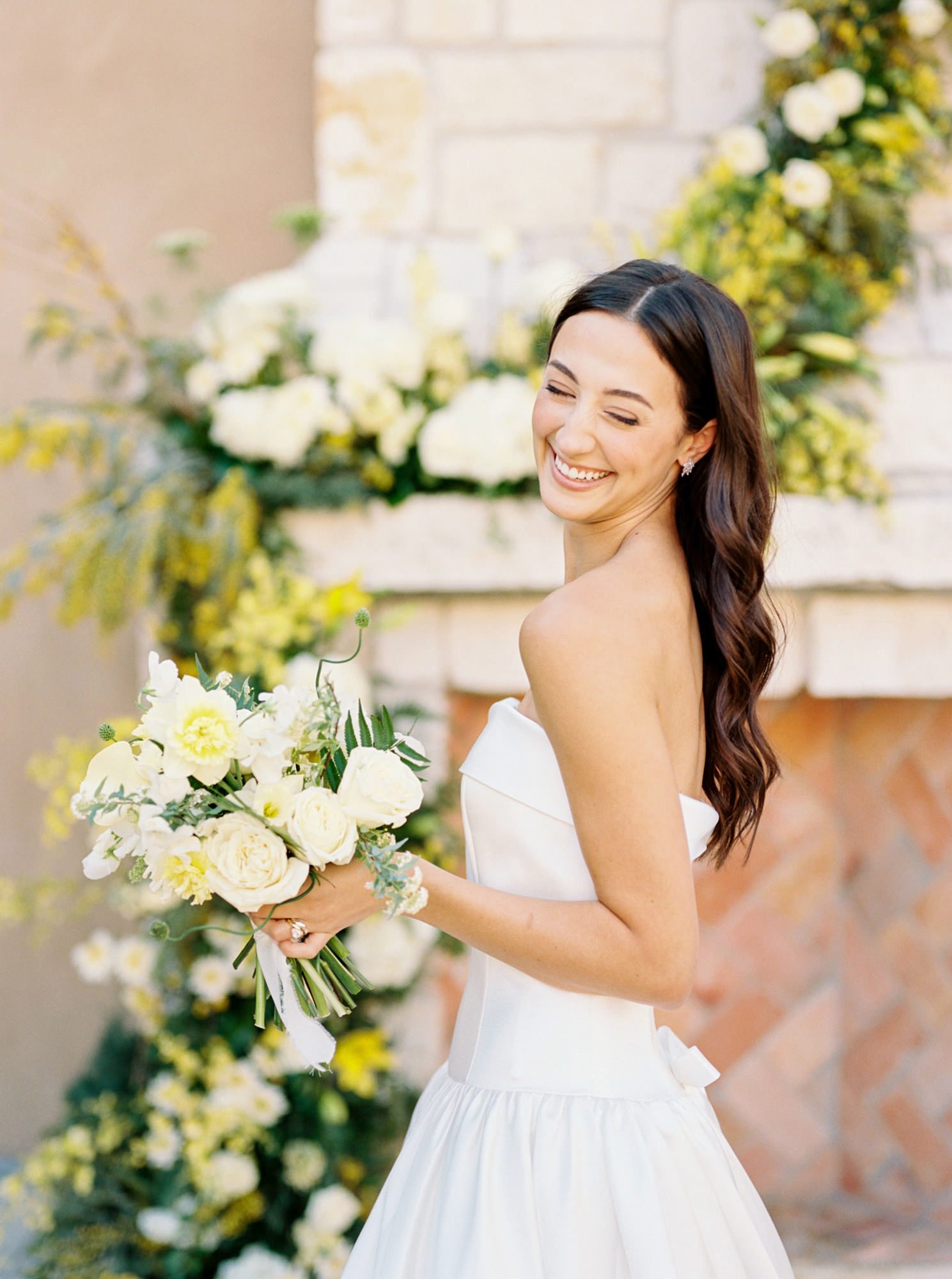
Some weddings feel layered in a way that reveals itself slowly. This was one of them. At first glance, everything reads classic and composed—black tie, crisp white, a palette that doesn’t ask for attention but holds it anyway. It leans into tradition without ever feeling rigid.
The foundation of this suite is contrast. Deep midnight black paired with a clean, soft white creates something striking without feeling harsh. It sets the tone immediately—formal, refined, and quietly confident. Every piece builds from that starting point, allowing the details to feel intentional rather than decorative.


The Invitation Suite
The invitation suite carries that balance beautifully. A polished black envelope with white ink addressing introduces the design with a sense of drama, while the interior softens into a timeless white invitation layered with delicate typography.
Script and serif are paired in a way that feels natural, not forced. The script brings movement and personality, while the serif anchors everything with structure. It’s the kind of combination that never feels trendy or dated.
Their sailboat, Last Chance, becomes a quiet motif woven throughout the design. It first appears on the wax seal, subtle and refined. But once you notice it, you begin to see how thoughtfully it’s been carried through the rest of the pieces. It never feels repetitive, just consistent.
At the center of it all is the custom oval wax seal. It feels simple at first, but ends up shaping the entire suite. It adds weight, texture, and just enough contrast to draw you in.
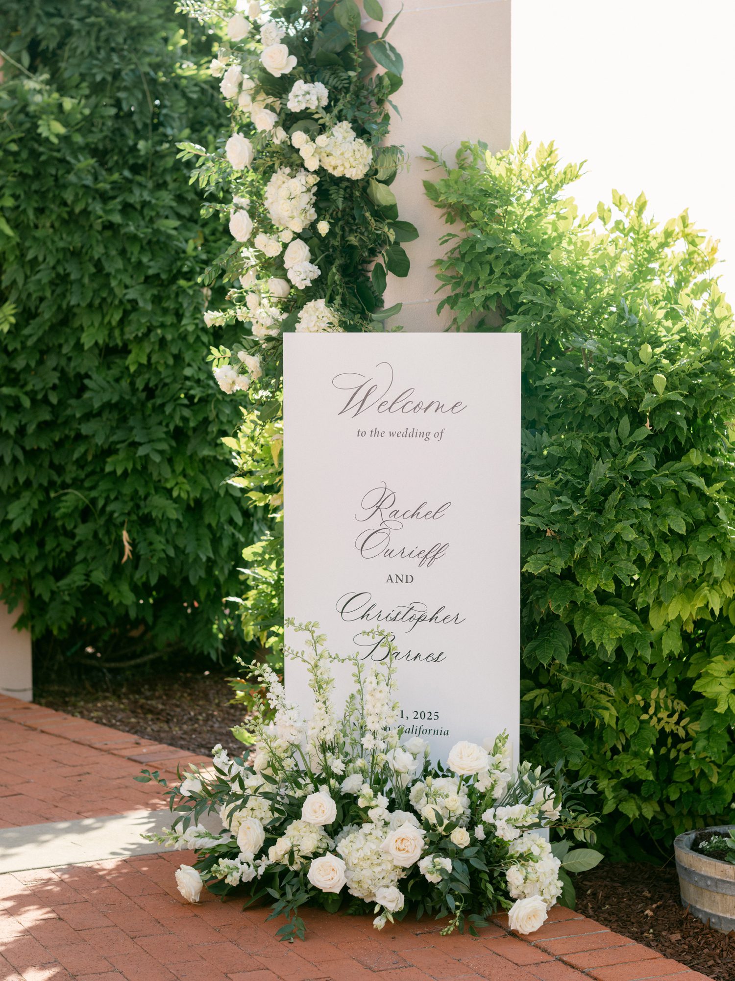
Day-Of Signage & Guest Experience
As the day unfolds, the stationery transitions seamlessly into signage.
From the welcome sign to the seating display and menus, every piece carries the same visual language established in the suite. Clean layouts, intentional spacing, and a restrained use of script keep everything cohesive. Nothing feels out of place or overdone.
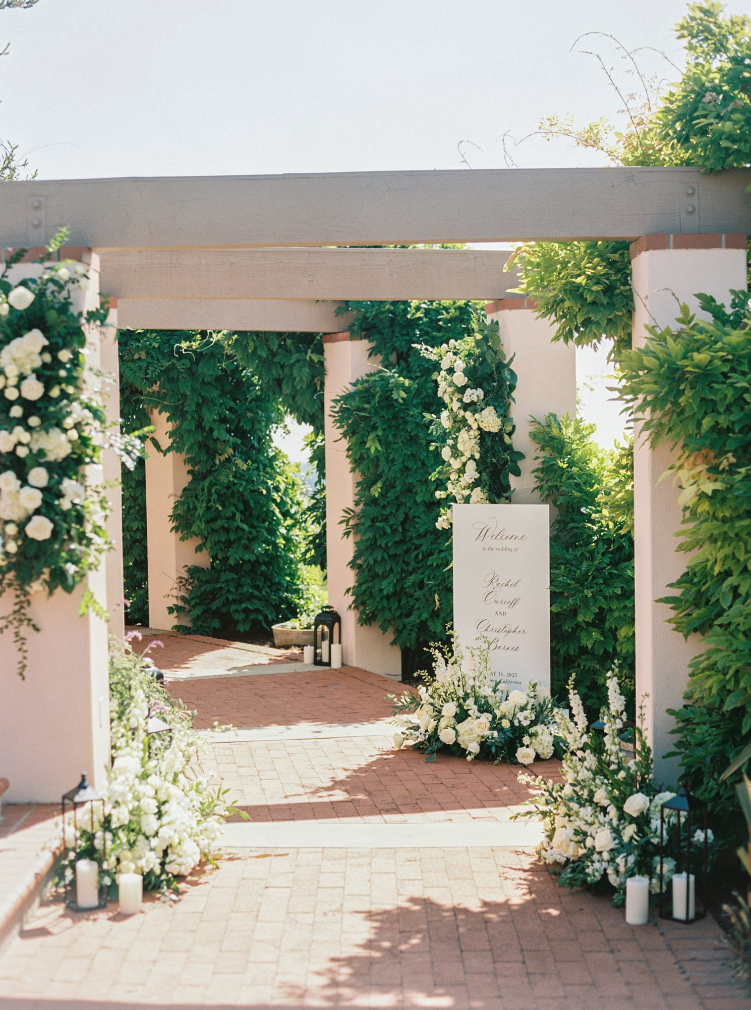


Set against the backdrop of lush greenery, soft white florals, and warm sunlight, the signage feels integrated into the environment rather than placed within it. It complements the setting instead of competing with it.
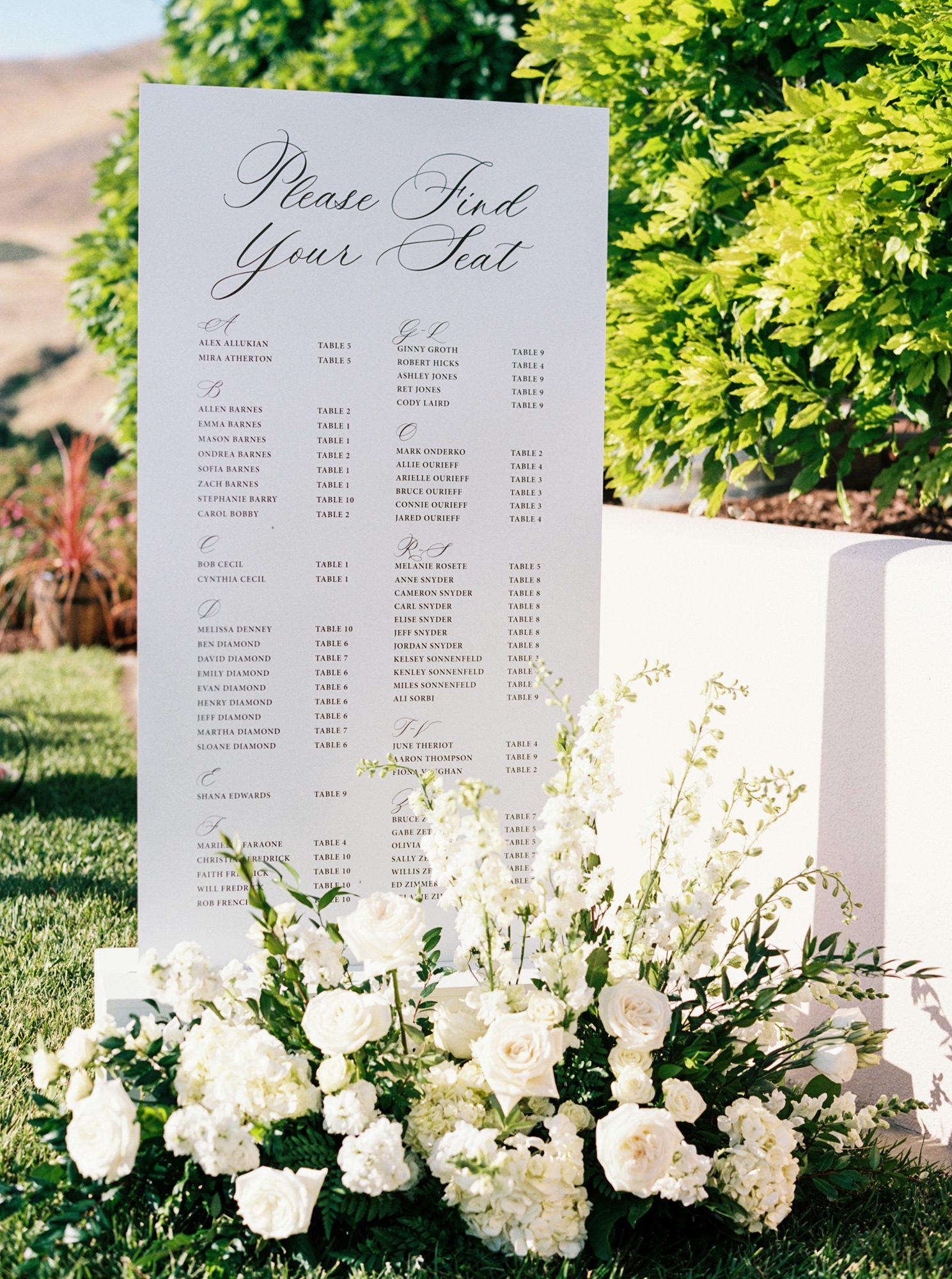
The seating chart, in particular, becomes a focal point. Elevated in scale but simple in design, it allows the typography and layout to speak for themselves. It’s functional, but still beautiful, exactly what it should be.
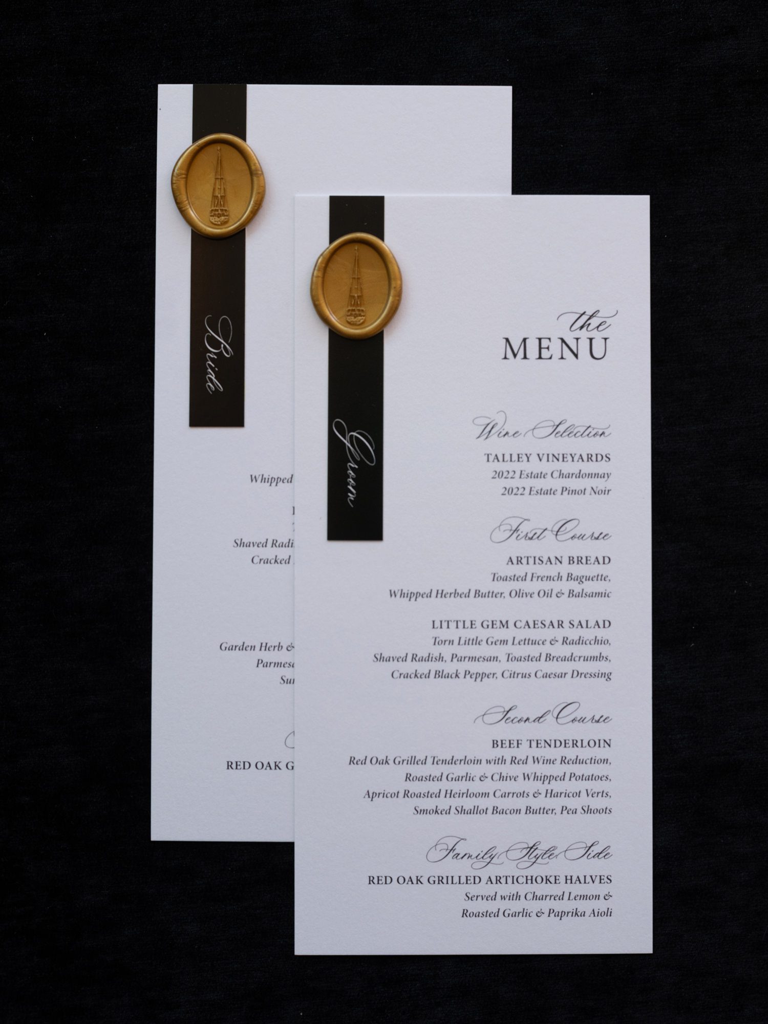
Even the smallest pieces, like menus and table number cards, are treated with the same level of care. The menus, in particular, become a quiet focal point at each place setting, layered over black linen, finished with a wax seal, and designed to mirror the invitation suite.
The same pairing of script and serif carries through, creating a sense of continuity from the first impression to the final details at the table. Against crisp white linens, glassware, and soft candlelight, the contrast feels elevated but never stark.
It’s that consistency that makes the guest experience feel considered from beginning to end.


Personal Details Woven In
What makes this suite so memorable isn’t just how it looks—it’s the way it reflects them.
The bar signage introduces another layer of personality. Featuring their dog, Cosette, it brings a sense of warmth and familiarity into an otherwise formal setting. It’s playful without disrupting the tone, exactly the kind of balance that makes a guest experience feel personal.
And then there’s one of my favorite details, the custom coloring page created for attending children. Featuring both the sailboat and Cosette, it’s such a simple gesture, but one that feels incredibly thoughtful. It invites everyone into the celebration in a simple, thoughtful way.


A Study in Balance
What stays with me most about this suite is its restraint.
It would have been easy to lean too heavily into the nautical elements or to over-layer the details. Instead, everything is held back just enough. The personal touches are present, but never overpowering. The palette is simple, but never flat.
It’s a reminder that timeless design often comes from knowing when to stop.
Structure and softness. Classic and personal. Elevated, but still inviting.


