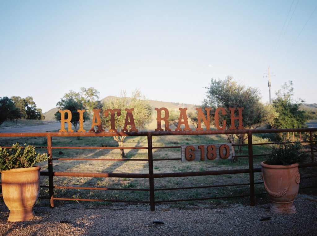
Venue // Riata Ranch Events
Contemporary typography, layered textures, and nature-inspired details come together in a wedding editorial that feels effortlessly sophisticated.
Some wedding designs don’t rely on excess; they rely on thoughtful details.
This editorial at Riata Ranch embraces exactly that philosophy. Every element feels intentional, allowing modern stationery, lush florals, architectural glass, and soft California light to work together in perfect balance.
The result is a celebration that feels elevated without feeling overdone.

Where Modern Design Meets Organic Beauty
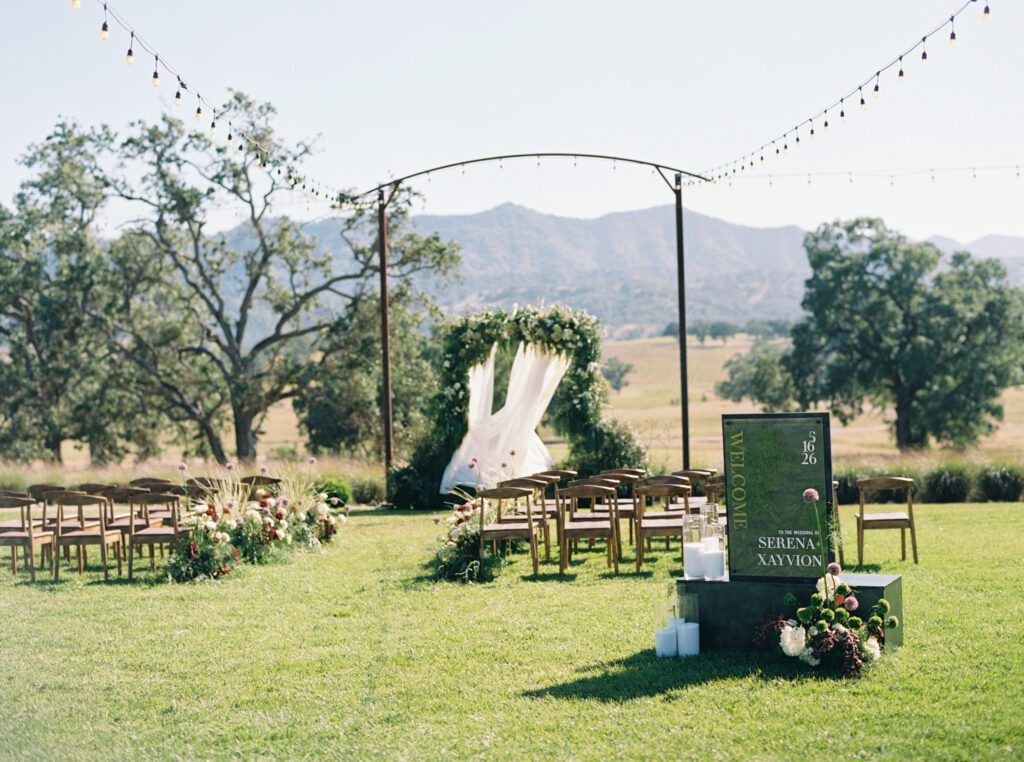
Riata Ranch provides a naturally striking backdrop with its greenhouse-inspired architecture, expansive lawns, and warm iron details. Rather than competing with the venue, the stationery palette echoes it.
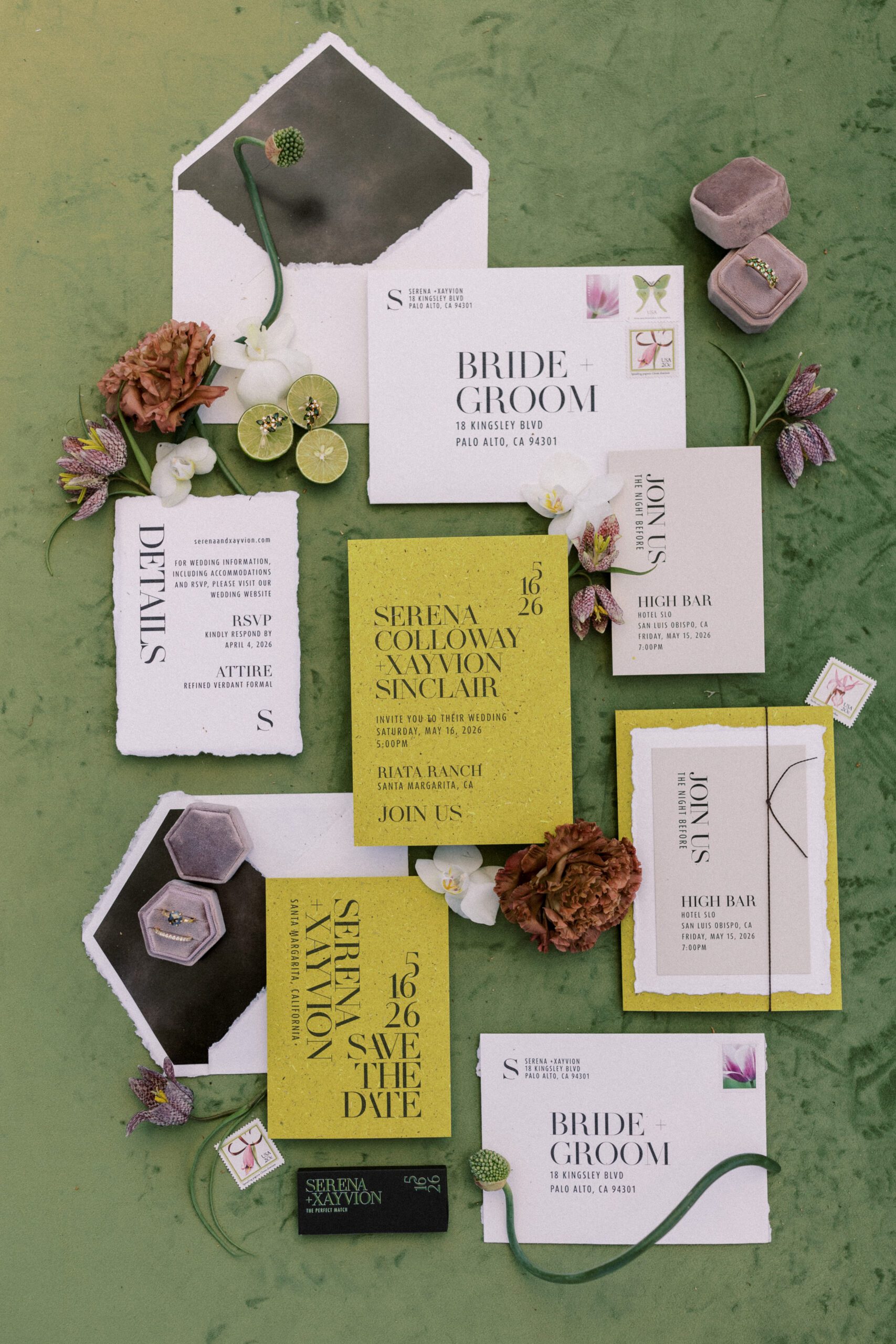
Soft sage greens, olive tones, frosted acrylic, translucent layers, textured handmade paper, and subtle botanical accents create a collection that feels connected to the landscape around it.
The overall aesthetic is refined, editorial, and quietly luxurious.
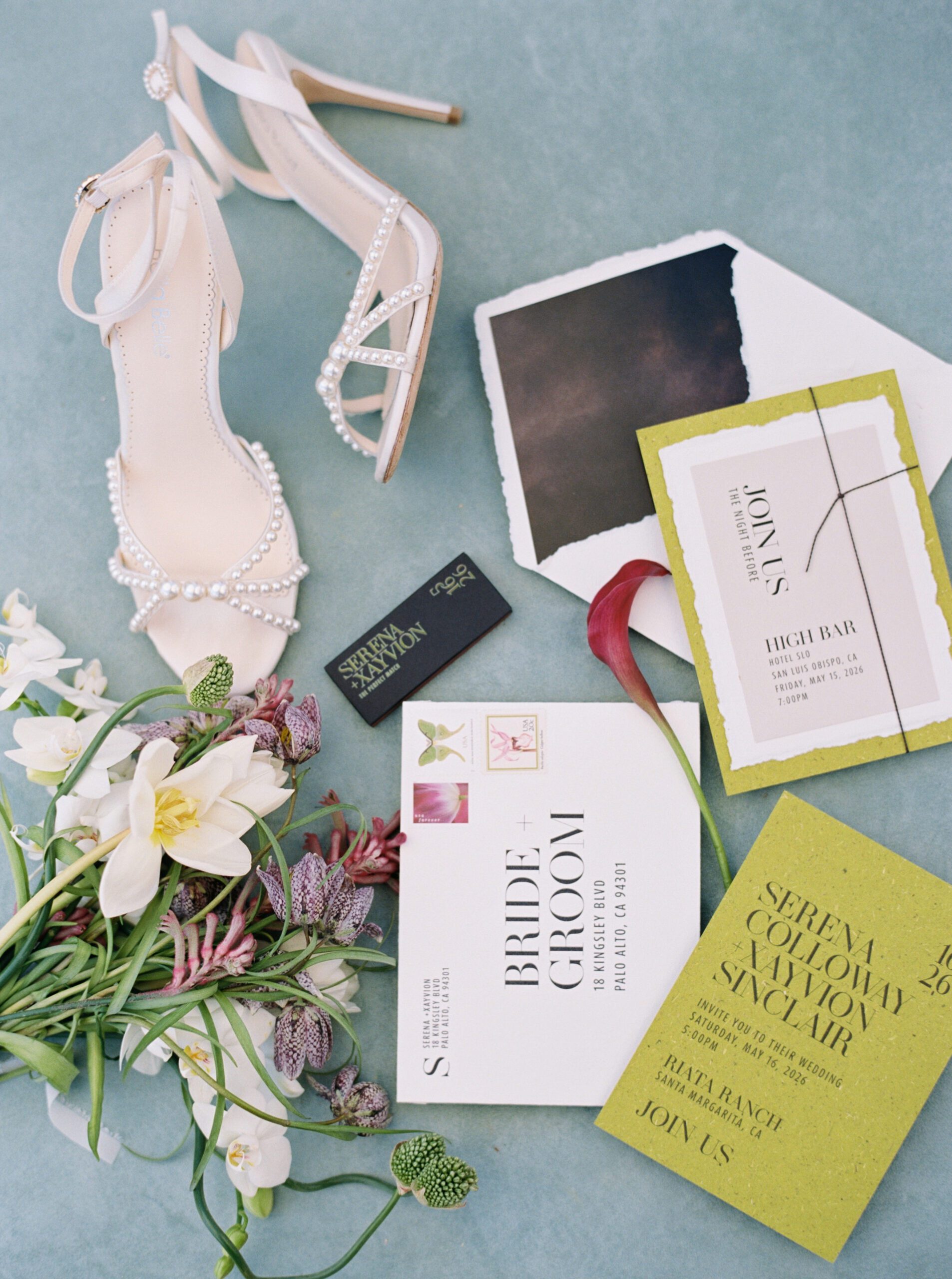
A Stationery Suite Designed to Make a Statement
The invitation suite immediately sets the tone.
Bright chartreuse handmade paper introduces unexpected color while elegant typography keeps the design timeless. Torn-edge paper layers soften the modern layout, creating beautiful contrast between clean lines and handcrafted texture.
Throughout the suite, every piece feels cohesive while serving its own purpose—from save the dates and invitations to rehearsal dinner and welcome event cards.
The collection proves that contemporary design can still feel warm and inviting.
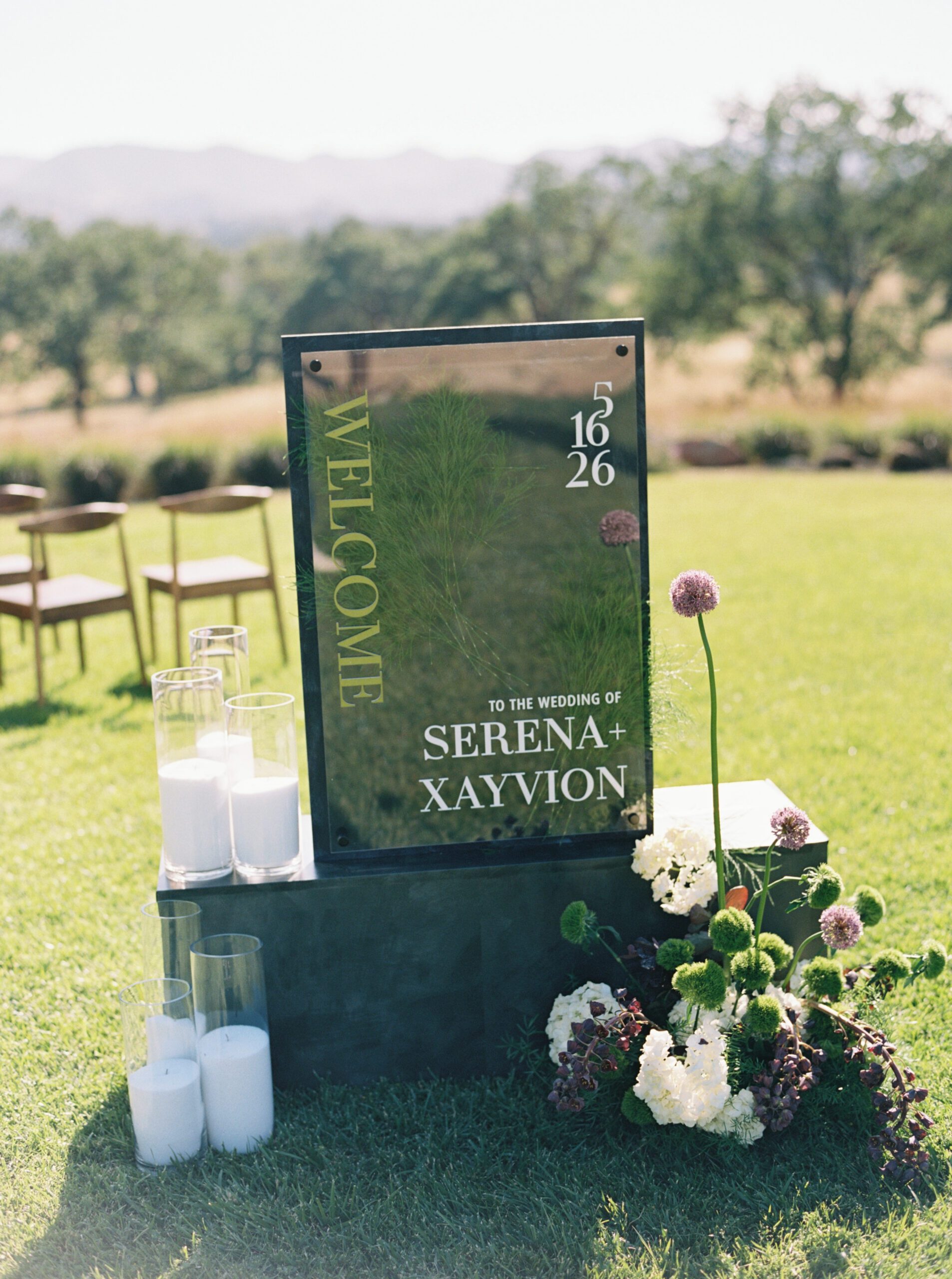
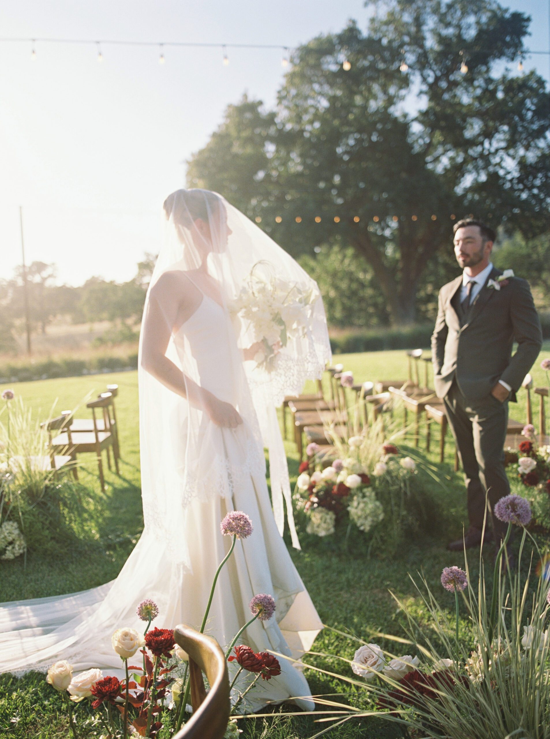
Thoughtful Details Throughout the Celebration
One of the strongest elements of this editorial is the consistency carried through every guest touchpoint.
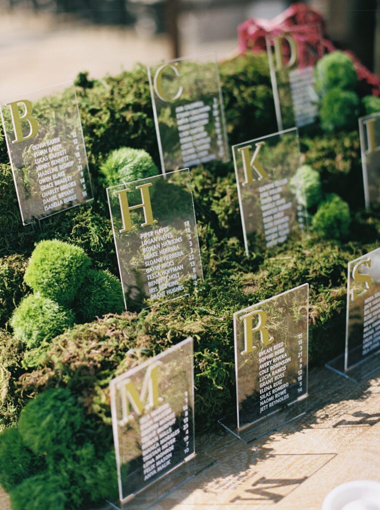
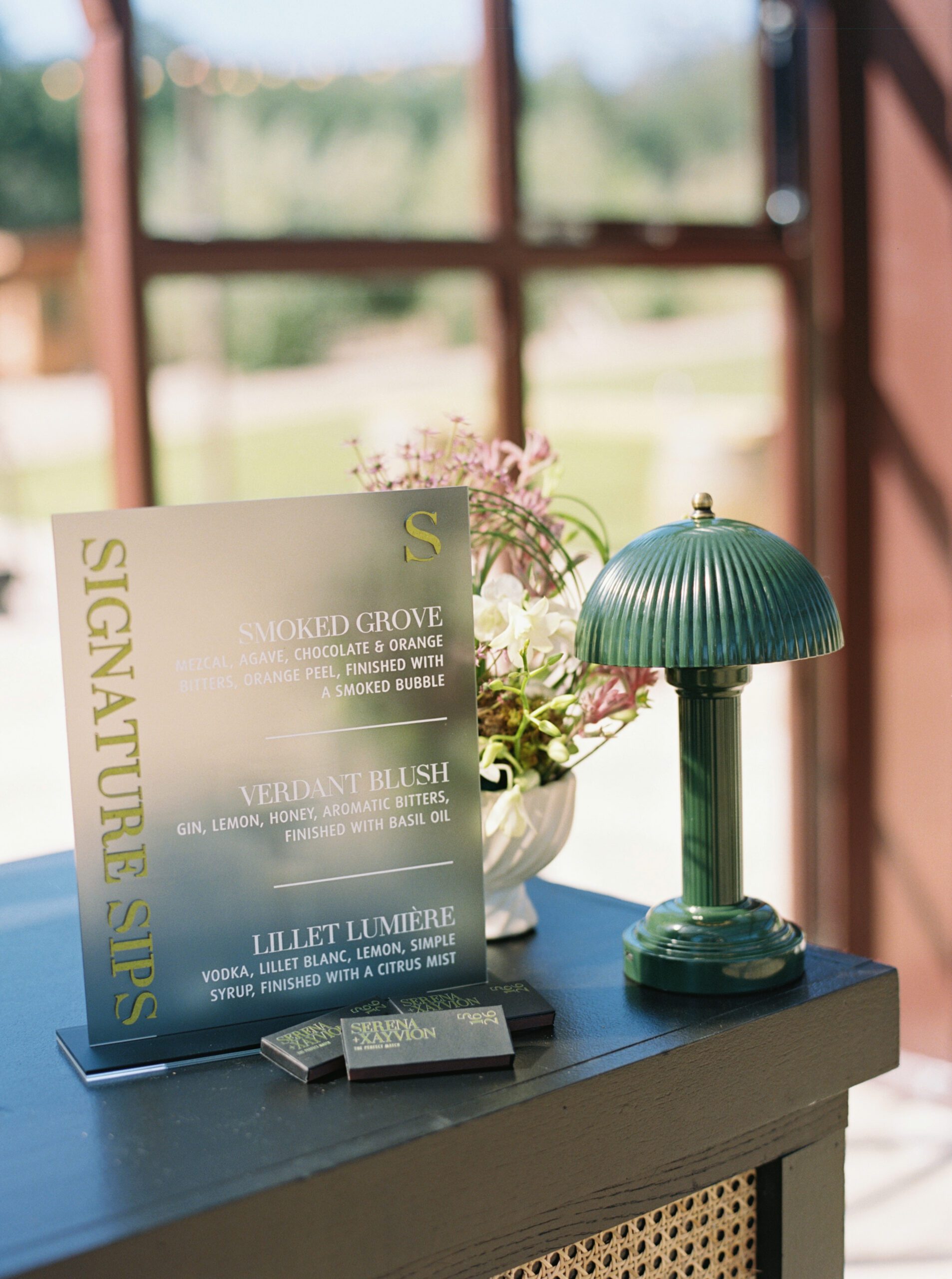
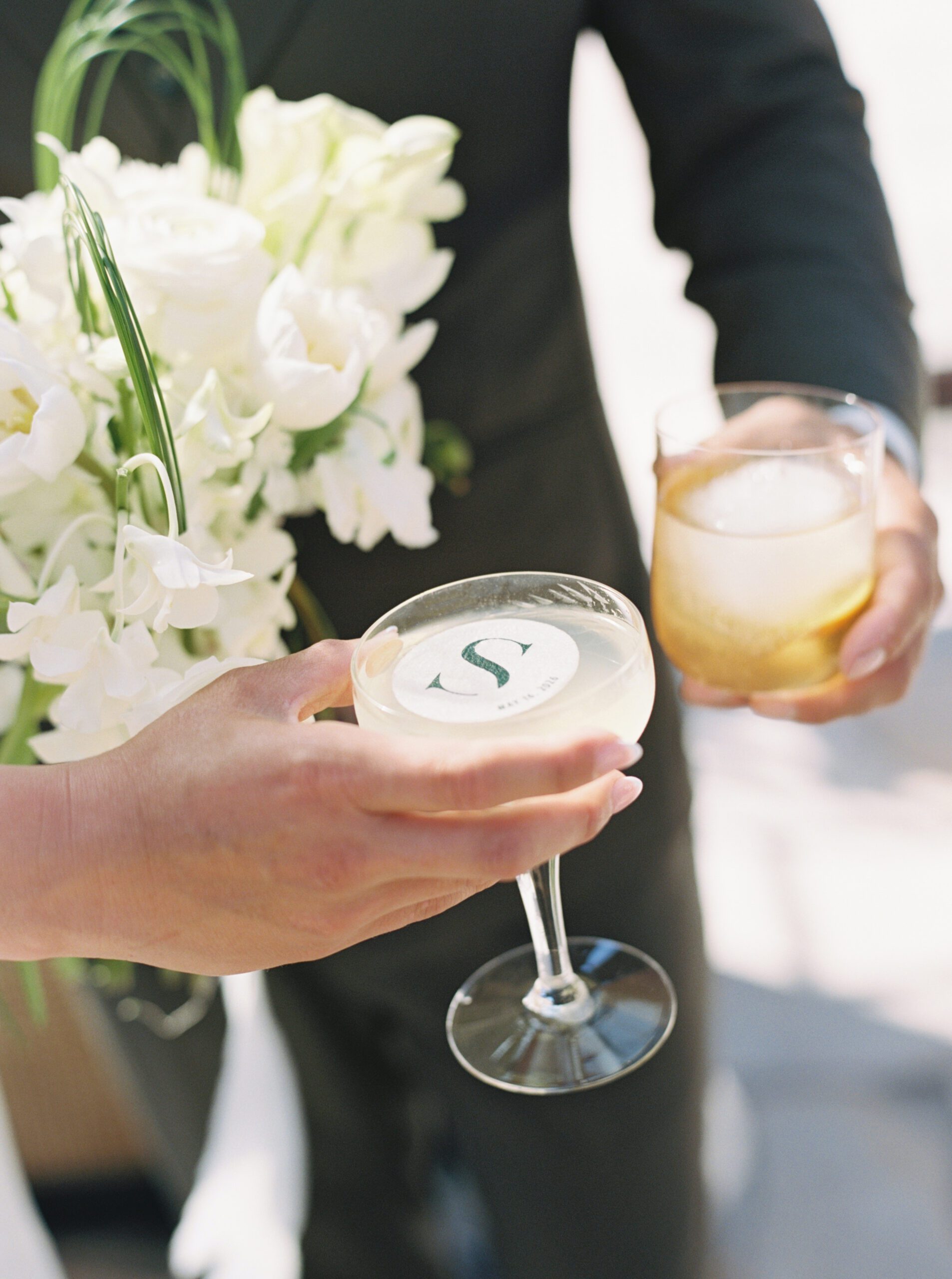
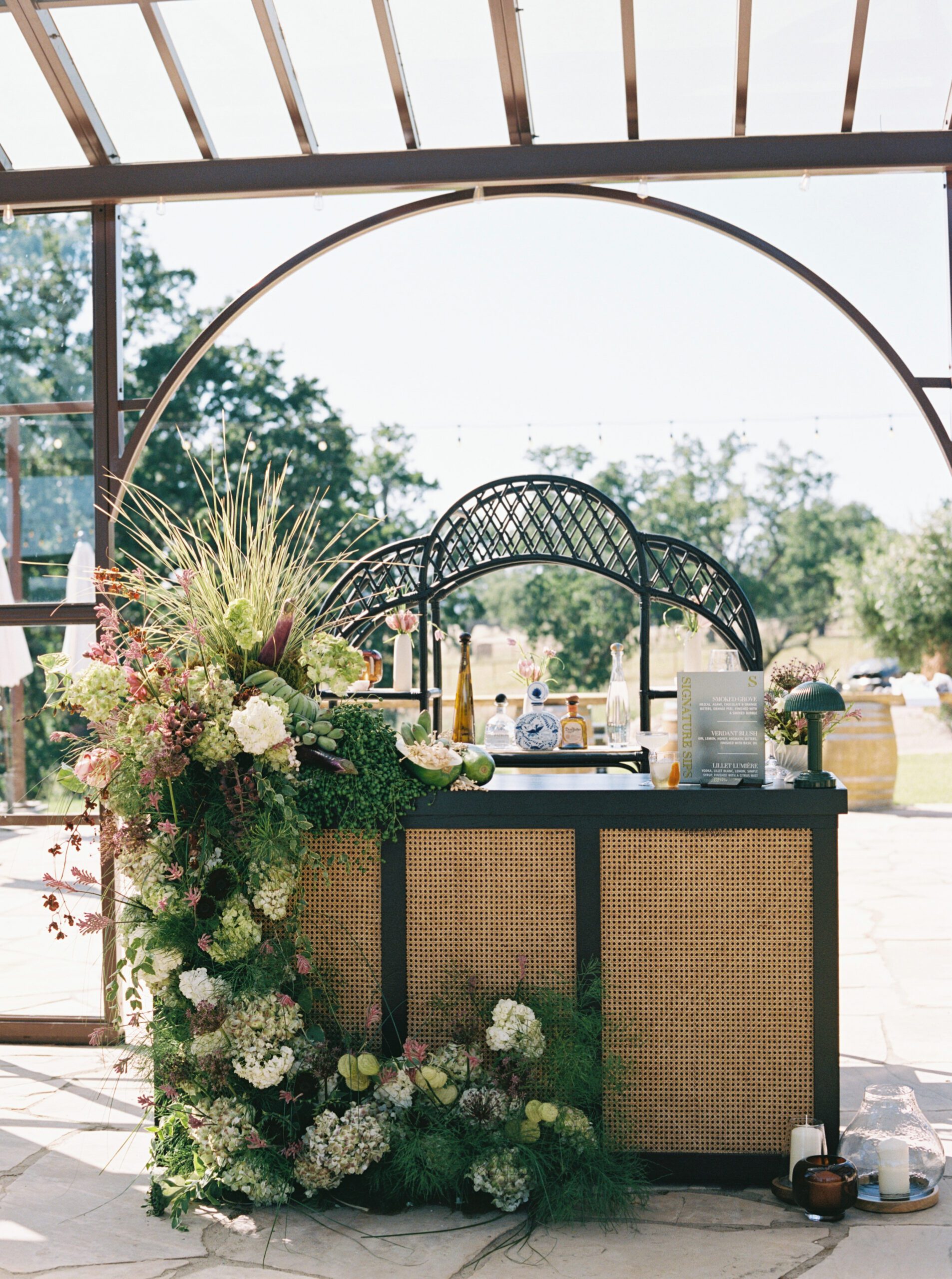
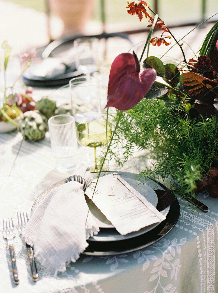
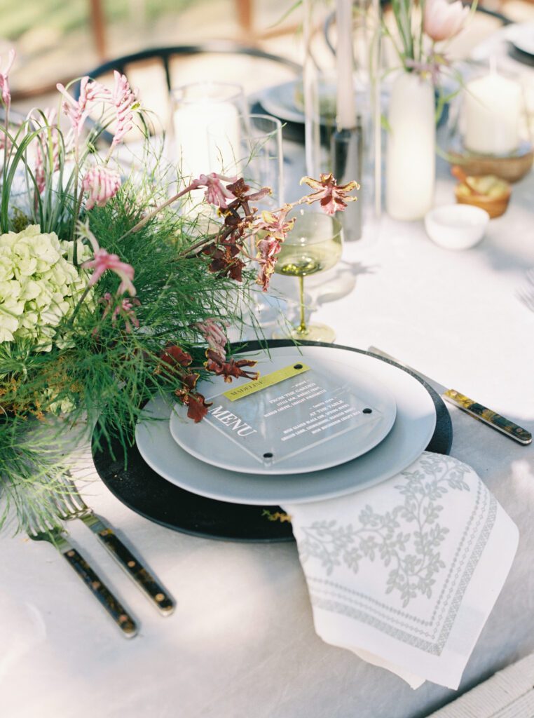
Custom acrylic signage welcomes guests before carrying the same typography and color palette into the signature cocktail display, seating installation, menus, and day-of paper goods.
Even functional pieces become part of the overall design experience rather than simply serving as information.
That continuity allows every space to feel intentionally curated.
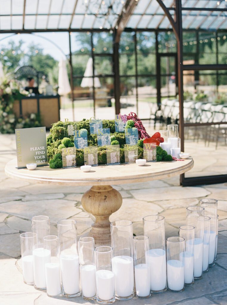
Layers of Texture
Instead of relying on bold color alone, this editorial builds interest through texture.
Handmade papers.
Transparent acrylic.
Moss installations.
Layered linens.
Delicate florals.
Polished glass.
Natural stone.
Together they create dimension while maintaining an understated palette that never overwhelms the eye.
Bringing Nature Indoors
The floral design embraces movement instead of symmetry.
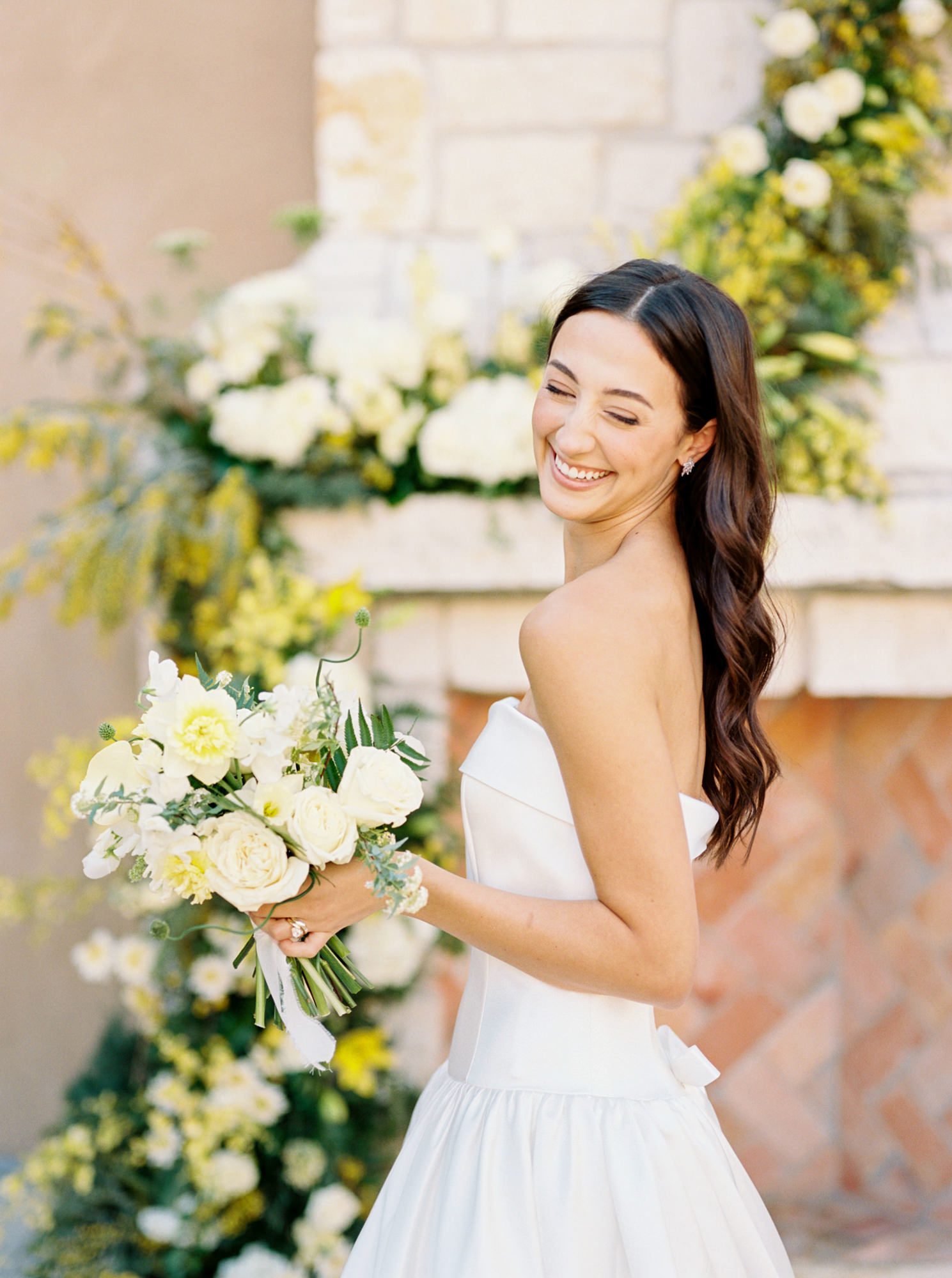
Airy greenery spills across tables while sculptural blooms in soft blush, ivory, mauve, and chartreuse weave naturally through every arrangement. Floral installations soften the venue’s architecture and beautifully complement the stationery’s botanical-inspired color palette.
The result feels fresh, modern, and deeply connected to the surrounding landscape.
Designing Beyond the Invitation
Wedding stationery is about far more than the invitation that arrives in the mail.
When every printed piece, from welcome signs to menus, cocktail displays, seating charts, and event cards, shares the same visual language, guests experience a celebration that feels seamless from beginning to end.
Those details often become the quiet thread tying an entire wedding together.