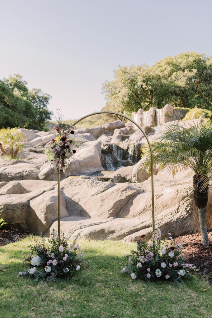
Venue // Villa Loriana
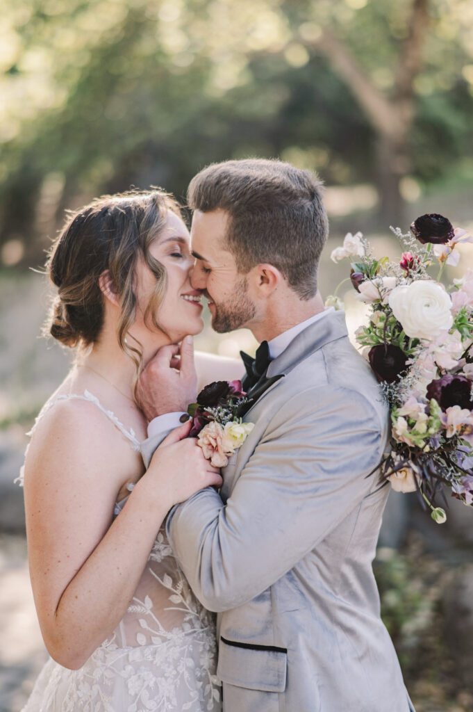
When a color palette blends romance with a little modern edge (think plum velvet, soft blush, and those beautiful architectural arches), it becomes such a fun foundation to design from. This suite was created for a collaborative styled shoot at the newly renovated Villa Loriana in San Luis Obispo, and I was so excited when it ended up being featured in California Wedding Day both in print and online.
This project felt like the perfect example of what I love most about stationery design, the intentional details, cohesive storytelling, and getting to create alongside talented, thoughtful creatives.

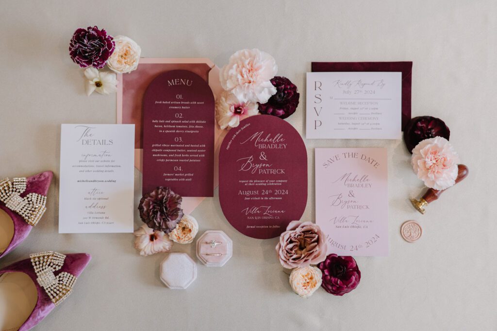
A Velvet-Inspired Color Story
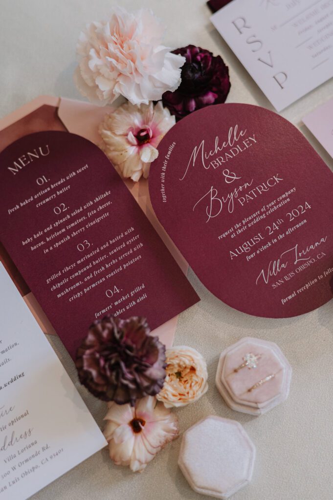
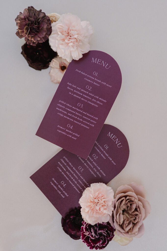
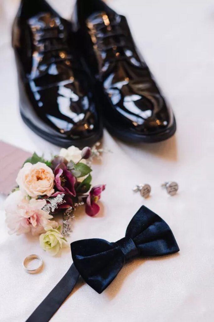
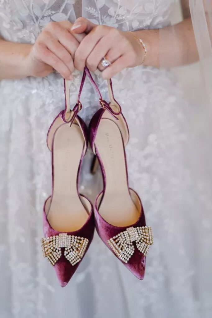
The inspiration for this suite really began with velvet, the deep and plush texture. Instead of creating a full velvet envelope (beautiful, but not exactly mail-friendly), I incorporated velvet in a way that felt both elevated and realistic: a maroon-plum velvet liner tucked inside the main envelope. It added the perfect amount of richness without overwhelming the design.
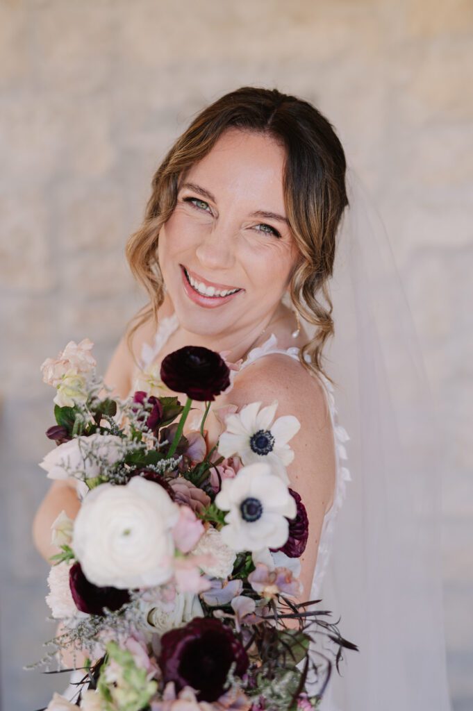
Finding the right velvet was its own creative moment. Maroon tones can lean all over the place. Some are too red, some are too pink, so I sourced several samples until I found a shade that paired perfectly with the bride’s velvet shoes and the moody florals. Once that color clicked, everything else in the suite fell into place.

Design Inspired by Villa Loriana’s Architecture
One of the first things that stood out to me about Villa Loriana was its architecture. It has so many soft arches and clean, refined lines. I wanted the stationery to echo those details in a way that felt subtle but thoughtful. A few design choices came directly from that inspiration:
- The Save the Date used gently arched typography that created an oval-like frame, mirroring the venue’s curved doorways and windows.
- The dinner menus repeated that same silhouette, bringing the architectural inspiration right onto the tablescape.
- Small curve details carried throughout the paper goods tied everything back to the space without feeling overly thematic.
For me, those little design echoes are what make a suite feel connected to its environment, almost like the venue and the paper are speaking the same design language.
A True Creative Collaboration
One of the things that made this shoot stand out to me was how thoughtfully the team approached the collaboration. Instead of a “Hey, can you do this next week?” situation (which is common in styled shoots), we had two months of notice and a genuine creative conversation at the beginning.
On a collaborative call with the planner, photographer, signage artist, and myself, we aligned on:
- Color direction. This early communication is what helped me source the exact maroon-plum velvet shade we needed. Velvet is so tricky, colors shift so much!
- Texture inspiration
- Architectural shapes
- Material sourcing
- Font selection and legibility
- How each element would support the tablescape and welcome signage
Because the stationery and signage were cohesive, every detail, from the velvet place cards, to the blush welcome sign, felt seamless and beautifully cohesive. The fonts chosen for the invitation suite were also used across the signage, ensuring consistency in style and readability.
This level of coordination is one of the reasons the “Velvet Dreams” editorial was ultimately recognized by California Wedding Day. When creative partners are aligned from the beginning, the result is elevated storytelling—and it shows.
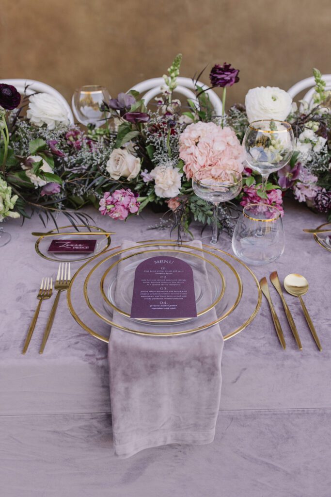
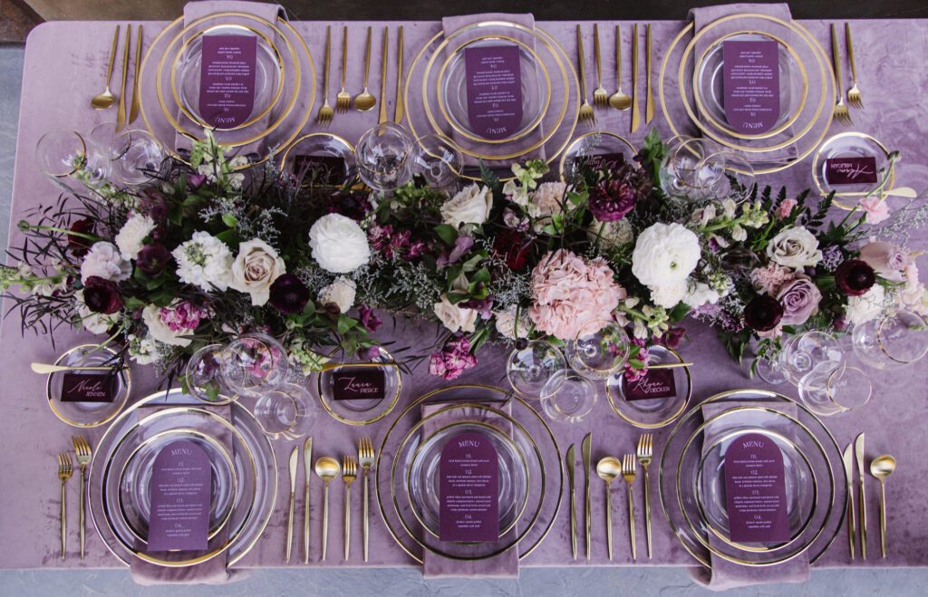
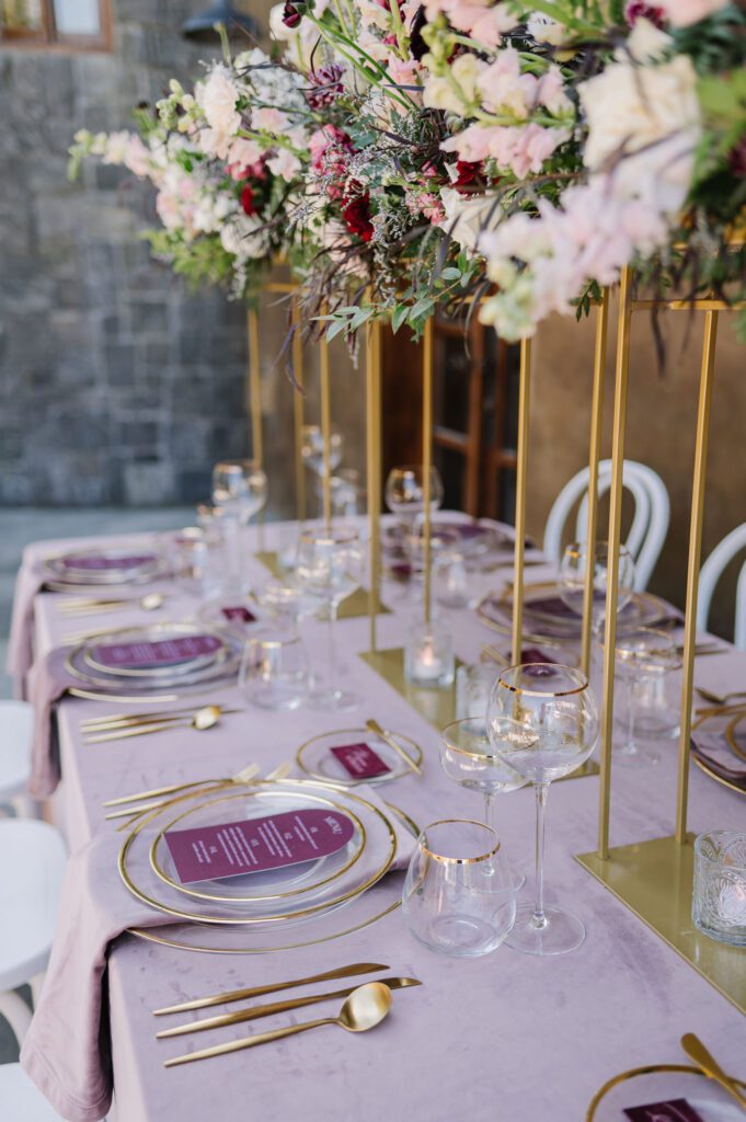
The Tablescape: Modern, Luxe, and Artfully Layered
The tablescape rentals used in this editorial are considered high-end luxury pieces, each requiring professional styling by the rental team. Lavender velvet linens, gold-rimmed chargers, glass layering, and lush florals created a dramatic, romantic environment that perfectly framed the plum menus placed at each setting. It was the ideal backdrop for the stationery details to truly shine.
One of my favorite parts of the project was collaborating with Miranda of Palette & Pine on the signage and place cards. To keep the visual story cohesive, we used the exact same velvet material used in the invitation liner and incorporated it into the guest place cards through a delicate heat-transfer application. This allowed the texture and tone to move beautifully from flat lay to tablescape. That rich, maroon-plum velvet also appeared on the welcome sign, paired intentionally with a soft blush backdrop that echoed the blush tones woven into the detail card and RSVP piece.
Cohesiveness was at the heart of the design. I selected the fonts and overall typographic style with both style and legibility in mind, ensuring the guest names would remain clear on the velvet and gold acrylic place cards. Even the curved detailing featured on the Save the Date was subtly carried through the signage, letting each touchpoint feel thoughtfully connected without ever feeling repetitive.
Honored to Be Featured
I am grateful to have collaborated with such a thoughtful, creative team, and equally grateful to see this work featured by California Wedding Day. Editorials like this remind me how impactful it is when artists come together with time, intention, and a unified vision.
For couples planning their Villa Loriana wedding or seeking a plum and blush wedding palette, this suite proves that modern design, romantic textures, and cohesive details will always create an unforgettable experience.


